4
Apr
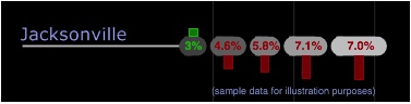
Zillow diagram of market segment value changes
Zillow has posted a series of excellent diagrams which show relative changes in assorted housing markets, broken down by segment. Their diagrams are very clear and allow fairly quick access to a lot of good information. Please go explore there, and then come back here for my commentary.
By my count, there are eight different axes of information represented for each city or market:
- lower bound of each market
- upper bound of each market
- overall span of each market
- lower bound of each segment
- upper bound of each segment
- overall span of each segment
- direction of change for each segment
- magnitude of change for each segment
The first six of these axes are a natural byproduct of using the (horizontal) stacked bar chart format that they’ve chosen. Given how bad bar charts typically are (N.B. Excel), they did a great job with the shapes, colors, and generally minimalist approach. They’re really quite good.
To fully optimize the diagrams, I’d make a few minor changes.
Sorting the markets alphabetically makes it easy to find specific markets by name, but difficult to compare them. Regional groupings might be more useful. In an ideal world, the user could select a few markets by name and compare just those selected few.
The weakest point, in my opinion, is the ambiguity introduced by the arrows. I understand that they are meant to represent trends, not specific quantities. However, they can easily be made a little more clear.
Judging from the legend, the length of the shaft of the arrow represents the actual quantity, while the head encodes direction (redundantly with position and color). In some cases, such as our hometown of Seattle, the heads are ponderously large compared to the length of the shaft, making anything more than a cursory comparison impossible.

Removing the heads and using rectangular bars would make it easier to compare values at a glance. If we wanted to get more specific, the percent change per segment could be displayed within the segment oval, in red or green text.
While not quite as dramatic, I think these changes make the diagram more useful, without reducing their accessibility.
Finally, and this is a minor point, the legend states that “the top and bottom groups have been cut for better visualization.” This is entirely reasonable, but it made me curious about where they chose to trim those groupings. It would be nice to know what fraction of the actual number of homes are represented in the high- and low-end bars.

Awesome analysis. Thanks for the ideas. It’s great to get some external feedback.
Comment by Tommy Unger — April 4, 2008 @ 5:55 pm
I had the same thing about wanting to know the trimming policy, and wanting to be able to put particular markets side-by-side. Also, I didn’t understand what “year over year change” meant. How many years is involved in that?
Personally, I like the arrowhead–it makes it quick to understand that the item represents change. I don’t get that from the headless bars.
Question for you: what are your thoughts on color coding? I’ve worked with just enough people who don’t see red and green as distinct that I’ve started thinking of color coding as a trap for a diagram designer. I look at the diagram and the information looks really clear, but I can’t trust that any particular viewer is going to see the information in that channel. Between colorblindness and monochrome printers/photocopiers, I’m not happy with a diagram unless it works in grayscale.
(Yeah, I know, the chromosome comic is dependent upon color-coding, but I wasn’t putting in the make-a-good-diagram effort on that, and it shows in more ways than just color.)
Comment by Sanguinity — April 5, 2008 @ 6:45 am
Sanguinity,
Those are insightful comments.
One alternative to the current arrow heads is to print them inside the bars, so they don’t affect the perception of length as much. Obviously for some short bars (Seattle) the heads would be tiny, but if the entire image used them, the meaning of the directionality would be clear from the markets with more change.
In the case of the red/green of the bars, yes, the colors could be lost. However, the position of the bars above or below the segment redundantly encode the same information as color (and the arrow heads). Without the color it might take a moment longer to understand what the bars mean, but I think that an interested party could figure it out pretty quickly.
In my example with the text in the segment, some of the contrast is very poor, and would probably be lost in a grayscale or photocopied version of the image. There are few enough segments that there isn’t really a risk of confusion if they all had the same pale fill color, which would allow good contrast with the digits.
Comment by Noah — April 5, 2008 @ 1:12 pm
Oh, I wasn’t referring to color on this diagram so much; as you said, color is redundant here. I was asking more as a general design prinicple—I haven’t quite been able to figure out your POV on inforation redundancy.
Comment by Sanguinity — April 6, 2008 @ 7:27 pm
Ah, sorry. Redundant encoding is a good thing. It aids in faster recognition and decoding of visual elements. So Zillow could have used just color, or just direction, or just up and down arrows to show the changes in the market values. By using all three, we very quickly can identify what’s going on.
Another example is the redundant use of color and placement to encode the three main topics in my speech diagram. Using just color, the nodes would look like colored beads all mixed up on a chronological necklace. Using just placement, the boundaries of the three main topics would be less easy to discern. As it is, the three topics are clearly differentiate.
Here’s the entirety of section 4.1.4 of my thesis. For more examples, see the few sections that follow.
4.1.4 The four components of diagrams
The content of a graphic can be classified into four groups. The relevant, useful content of a graphic is either message or redundancy, and the balance is either decoration or noise (Horton, 1991, p. 27). The message is the information content that is being conveyed to the reader. If part of the message is encoded in multiple ways, such as by shape and by color, it is redundantly encoded. Redundant encoding provides the reader with multiple ways to extract the same knowledge, and has been shown to improve performance (Mayer, 1989).
Visual content that does not contribute to readers’ understanding is either decoration or noise. Horton differentiates the two by defining decoration as visual elements that increase the appeal of the image without interfering with the actual message. Noise is anything that does not contribute to the message or the appeal of the image, and therefore interferes with the message (Horton, 1991, p. 28).
Comment by Noah — April 6, 2008 @ 7:55 pm
To answer your initial question, I think color coding is great, if done right. It’s a powerful preattentive attribute, it takes up no extra space on the page, and we are very used to color coding to identify and differentiate things (starting with children’s blocks).
Common errors are choosing colors that have inappropriate meaning in the context, or are loud enough to be distracting. Also, color is a poor encoding for ranked or ordered information*. Our brains don’t naturally order color, the way we do with brightness, length, and size. Associating an order with colors a learned and inconsistent encoding, and should not be relied upon.
* Heat maps typically use color in an ordered way, and we’re used to it because it is familiar, not because it is intuitive.
Comment by Noah — April 6, 2008 @ 8:19 pm