16
Nov
Mapping Migration critique
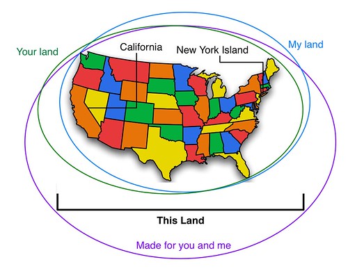
A friend asked me what I thought about the NYT Mapping Migration visualization.
It’s interesting that they note this is a new (experimental) kind of visualization; frankly I think it doesn’t work very well.
To review, you (well, I) do visualization like this (one tweet version; hours long version).
In this case, it feels more like they had a structure they wanted to use (well, two structures, treemap and geographic map, they wanted to mash up and use). So that’s a fundamental design failure because structure drives meaning so strongly, you really ought to pick structure in response to your purpose, not structure first. But this seems structure-driven, not purpose-driven.
If I were to communicate this same information I’d say the purpose is to show the relative proportions of origins of each state’s population. Now a geographic map is a bad way to talk about population in general, because geographic size has nothing to do with population (NJ has about 10x the population and 1,000x the population density of Alaska), and so you get all kinds of accidental distortion. However, geographic maps are really good at showing things like regional trends, so there may be some value there.
So how to show proportion per state and also maintain regional relevance? For proportion a classic tree map (subdivided rectangular area, not Voronoi), or even pie graph, per state could work; they almost got that right. Instead of using the geographical shape of each state, each state could be represented with a size proportional to its population with a cartogram, similar to how the electoral vote results maps work.
The result would be the largest square for California, smaller squares for other states. Each state square would be subdivided into regional areas, each area proportional to population origin and colored as they have them here. If it was me, I’d use consistent placement for the colors, yellow/west always on the left, red/east always on the right, etc.
If you wanted to do something other than a tree map, bar graphs (either stacked or side by side) per state would work perfectly well too, but that’s a little harder to implement and keep the geographical relevance.

1
May
Beautiful Visualization Chapter 1: On Beauty
This is an excerpt from my chapter in Beautiful Visualization. You can download a pdf of the entire chapter.
Chapter One: On Beauty, by Noah Iliinsky
This chapter is an examination of what we mean by beauty in the context of visualization, why it’s a worthy goal to pursue, and how to get there. We’ll start with a discussion of the elements of beauty, look at some examples and counterexamples, and then focus on the critical steps to realize a beautiful visualization.
[I use the words visualization and visual interchangeably in this chapter, to refer to all types of structured representation of information. This encompasses graphs, charts, diagrams, maps, storyboards, and less formally structured illustrations.]
What is Beauty?
What do we mean when we say a visual is beautiful? Is it an aesthetic judgment, in the traditional sense of the word? It can be, but when we’re discussing visuals in this context, beauty can be considered to have four key elements, of which aesthetic judgment is only one. For a visual to qualify as beautiful, it must be aesthetically pleasing, yes, but it must also be novel, informative, and efficient.
Novel
For a visual to truly be beautiful, it must go beyond merely being a conduit for information and offer some novelty: a fresh look at the data or a format that gives readers a spark of excitement and results in a new level of understanding. Well-understood formats (e.g., scatterplots) may be accessible and effective, but for the most part they no longer have the ability to surprise or delight us. Most often, designs that delight us do so not because they were designed to be novel, but because they were designed to be effective; their novelty is a byproduct of effectively revealing some new insight about the world. keep reading…
24
Jan
Organic growth of a social network
There are many visualizations of social networks, most of which focus on who knows who. They provide a basic view with limited utility. Some visualizations refine this basic view by grouping areas of people who share common contexts (e.g. college, work, etc.). That approach can add some insight through the slightly increased complexity, but it is still a very limited view of the network.
This movie reveals more knowledge by showing not only which individuals know each other, but also when and how the social network formed, by calling out the contexts and individuals responsible for an introduction between two new friends. Visually representing more complexity allows the viewer a deeper understanding of the social dynamics and causalities involved.
Comments closed due to spam.
5
Feb
Bike map legends
Here’s a straightforward case of two different agencies presenting similar information in different ways, one with better design choices and one with more arbitrary, less useful choices. Both King County and the City of Seattle (where I live) publish regional bike maps with markings for bike lanes and trails. Compare how they are encoded. keep reading…
14
Oct
Infocamp 2008 Presentation
This is the slideshow and audio from my Infocamp 2008 presentation on User-Centered Information Design.
The audio synchronization seems to work when played straight through, but not when you manually advance the slides.
7
Mar
Humorous pop-culture visuals: Song Charts
I was just introduced to the Song Chart group group on Flickr. It’s full of visualizations of song lyrics. Many are clever, many are hilarious. This is my contribution.
7
Jan
Shopping cart map
Visiting unfamiliar contexts can lead to interesting discoveries. In this case I’m in Williamsburg Virginia, and was impressed that a regional grocery chain, Bloom, had store maps mounted on their shopping cart handles. Brilliant.
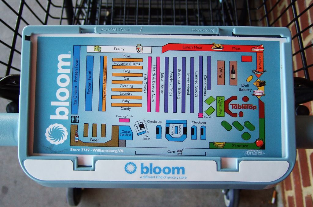
(click for full sized image)
A quick google for them reveals a blurb where they characterize their stores as “uncomplicated” and “hassle-free.” Their aim for a positive customer experience seems to be yielding some good ideas.