5
Sep
Guaranteed Successful Design talk
I gave a fun (and useful?) lightning talk at Startupfest Montreal 2016, and Ignite Seattle, and a full-length version at the O’Reilly Design Conference, entitled Guaranteed Successful Design. I hope you find it useful and/or entertaining.
Here’s the slide deck with notes and 5 minute video from Ignite Seattle.
Here’s the full-length slide deck and 45 minute video from the O’Reilly Design Conference 2017.
17
Jan
How to pick a graph
I just tweeted this:
Step 5: What graph do I use?
4: What data matters?
3: What Q’s need answering?
2: What actions do I need to inform?
1: What do I care about?
20
May
How to buy a practical bike
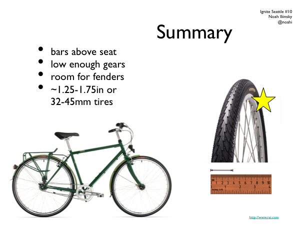
Last summer I gave a talk at Ignite Seattle on how to buy a practical bike. This is the slide deck for that talk. There’s no audio, but you can gather most of it from the images. The summary is below the presentation.
In general, when shopping for a bike, the best thing you can do is ride several and find one that sings to you. Details of manufacturer and parts are less relevant if you like how the bike feels when you ride it.
- At a give price point, most new bikes are going to have a similar mix and quality level of parts.
- Look for a bike where you can get the handlebar at or above the height of the seat when the seat is adjusted to your leg length.
- Low gears are critical if you live near hills or plan on carrying or pulling loads.
- You probably want at least 32mm / 1.25″ wide tires. You don’t need a suspension, or knobby offroad tires, or any tread at all, in the city.
- Your frame should have room for fenders (you can wait until September for those, but shops may install them free if you buy with your new bike).
3
Jan
Why Apple isn’t worried about iPad competitors
In a New York Times article entitled Rivals to the iPad Say This Is the Year, makers of would-be iPad competitors reveal their strategy. Tablet manufacturers “who have discussed their plans say they will both offer specific features that the iPad is lacking, and undercut their competitors on price.” (Emphasis mine.)
Reading this gave me a flashback to almost five years ago, when Samsung released an mp3 player that they hoped would compete with the iPod. It was a good product, and it was doomed to fail. David Pogue nailed it:
The iPod’s competitors have wasted years of opportunity by assuming that they can beat the iPod on features and price alone. They’re wrong.
In fact, at least six factors make the iPod such a hit: cool-looking hardware; a fun-to-use, variable-speed scroll wheel; an ultrasimple software menu; effortless song synchronization with Mac or Windows; seamless, rock-solid integration with an online music store (iTunes); and a universe of accessories. Mess up any aspect of the formula, and your iPod killer is doomed to market-share crumbs.
I predict that history will largely repeat itself. Apple doesn’t win because they provide more features, they win because they provide a more intentional design that results in a better experience. Many other tablets will be sold and loved (my friends love their Samsung Galaxy Tabs), but no device will present a credible threat to the iPad’s market dominance until it offers a similarly intentional, compelling, and coherent experience.
8
Apr
UI FAIL
Unfortunately, you can’t click anywhere below to get to the categories explained there, and instead must find the category in the pulldown menu above. Terrible.
12
Mar
Tire selection chart
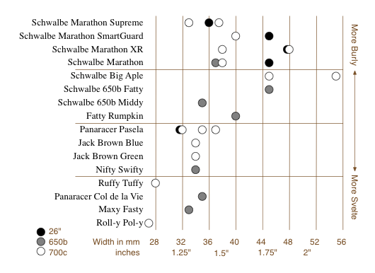
This is a short story of user experience, information visualization, and design choices. I like Rivendell Bicycle Works for a lot of reasons (see below). However, one thing they don’t do particularly well is allow you to compare products on their web site.
When comparing a few randomly sorted parts, such as rear deraillers, looking at all 3 or 4 choices and then choosing one is relatively easy. When the choice is among 16 tire models in three rim diameters, various widths, some with various features (kevlar bead, anti-puncture, etc.), spread across three pages, in no particular* order, doing a comparison and then confidently choosing one is really, really difficult.
To address this sub-optimal user experience issue, I created this chart to make life easier for customers, improve the interface for comparing the tire offerings, and hopefully improve sales.

It allows the (potential) customer to quickly focus on the appropriate tires(s) based on desired rim size, tire width, and toughness/quickness, and then click the chart to go directly to the tire’s page. (Note that some of these links are going to break as the selection of tires for sale changes.) keep reading…
12
Feb
Bourbon-molasses Supernatural Brownie recipe
[I’m justifying posting a recipe here with the thinking that good food is a good user experience.]
These are my favorite brownies. The recipe is shamelessly stolen (and modified) from the The New York Times and The Splendid Table. See those sites for advice on using baking parchment, fancy unpanning, adding nuts (blasphemy!) or frosting, etc. My additions and notes start with an *.
keep reading…
5
Feb
Bike map legends
Here’s a straightforward case of two different agencies presenting similar information in different ways, one with better design choices and one with more arbitrary, less useful choices. Both King County and the City of Seattle (where I live) publish regional bike maps with markings for bike lanes and trails. Compare how they are encoded. keep reading…
19
Jan
Configuring IMAP for Gmail, Apple Mail.app, and iPhone (and iPod touch) (and probably iPad)
Update 5, December 2011: This appears to work for Apple Mail 5 under Lion / OSX 10.7 as well.
Update 4: Step 1.1 is no longer necessary, due to updates in gmail.
Update 3: Sounds like iOS4 addresses some of this with an archive/delete toggle for gmail, as pointed out in the comments.
Update 2: I suspect these instructions will work on an iPad as well as iPhones and iPod touches, but they haven’t been verified. If anyone with an iPad can verify, please post. Thanks!
Update: This post is all about how to get messages to actually delete from gmail when you delete them in Maill.app or on your iPhone, rather than having deleted messages saved in the archive, As Google Intended. If you like the idea of saving every message forever in the gmail archives, their setup instructions are 100% correct and you don’t need this post.
===
This post was spawned by my frustrations with gmail, and my inclinations to save other people the effort of having to figure it out on their own.
Introduction: IMAP, Gmail, and You
IMAP is a mail protocol that allows continuous synchronization between a mail host and one or many clients; this is a Very Good Thing. For more on IMAP and why you should want to use it, see Google’s introduction, and the first part of this post at TechnoLawyer.
Gmail approaches mail differently than most mail hosts/providers. Rather than filing messages into single folders, messages can be tagged with any number of tags. The advantage of tags over folders is that a single message can be filed in multiple places, each one associated with a different tag. The Inbox is treated as another tag by Gmail. An unfortunate side-effect of this is that when most IMAP clients (mail applications) attempt to delete a message, Gmail removes the Inbox tag, but does not delete the message. The message remains in the archive for that account, and can been seen in the All Mail view. The only exceptions to this behavior are messages in Gmail’s Trash or Spam views; these messages do not appear anywhere else. When they are deleted from Trash or Spam they are gone forever. (Here’s a conceptually useful table of Gmail’s default interactions with IMAP client actions)
It is possible to configure Gmail and Apple’s Mail application to appropriately delete messages from Gmail when they are deleted in Mail. These instructions also show how to store all drafts and saved messages on the Gmail server, and how to configure your iPhone for the same behaviors. keep reading…
1
Jun
Pixel rulers in Visio
Should you be required to work in Visio, you may well find yourself, as I did, wishing to measure your drawing in pixels. I couldn’t figure out how do do it, though Visio does support such diverse measurements as Ciceros and Didots.
I finally found the definitive answer from Microsoft: For some types of drawings, you may want to change the measurement units to pixels. However, a pixel isn’t a unit of measurement. A pixel is just a dot on a screen and the size of the dot varies for different screens. To simulate pixels, set the measurement units to points.
Needless to say, this is not satisfying. It’s true a pixel is only an on-screen measure, and is clearly only useful for a few, obscure situations, such as when creating interface mockups, wireframes, or prototypes for software, the web, or any other sort of images meant to be viewed on a screen.
Luckily, Visio provides a set of features that allow a fairly simple, two step work-around. Warning: doing this on existing Visio documents may severely distort your existing drawings. I suggest working on duplicate files, not originals. keep reading…
