18
Sep
More economic charts
A few more bits of visual goodness related to dollars and sense for this election season.
===
Freakonomics has a nice follow-up to the Washington Post graphic below, showing two slightly different versions that are optimized to see the breakdowns in numbers of people and percent of tax income related to each segment. Great stuff. Go check it out.
(Via Tim O’Reilly’s twitter)
===
Digital Roam has a whole series of hand-drawn micro-graphs showing economic activity and indicators for the Bush and Clinton administrations. Clear, simple, and very compelling.

4
Sep
Tax Policy Graphs
The Washington Post has published this excellent graphic comparing the proposed tax policies of the two mainstream candidates. It does a great job of clearly contrasting the impact per tax-bracket in terms of percent and average change in tax burden.
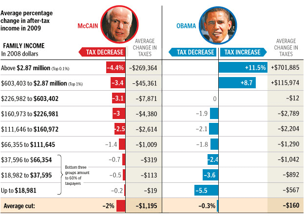
Click through for their brief commentary. (And note that it’s brief because the graph does a good job of saying it all.)