20
Dec
Great visualization: Pro-football game charts
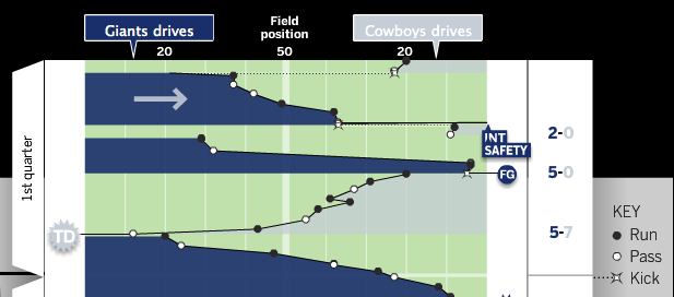
From Chartball.com: Pro-football game charts.

They’ve done an excellent job here, visually representing:
- direction of play
- position of each down
- game time on the vertical axis
- type of play (run, pass, kick)
- scoring events
- other events, such as fumbles and intercepts
Great use of the field metaphor and direction, as well as team colors. I’d like to see what this looked like with encodings for the downs (shape for type of play, and down encoded by saturation?), but overall it’s excellent. And I should note that the detailed information on each play is available when you mouse-over each event.
24
Jan
Organic growth of a social network
There are many visualizations of social networks, most of which focus on who knows who. They provide a basic view with limited utility. Some visualizations refine this basic view by grouping areas of people who share common contexts (e.g. college, work, etc.). That approach can add some insight through the slightly increased complexity, but it is still a very limited view of the network.
This movie reveals more knowledge by showing not only which individuals know each other, but also when and how the social network formed, by calling out the contexts and individuals responsible for an introduction between two new friends. Visually representing more complexity allows the viewer a deeper understanding of the social dynamics and causalities involved.
Comments closed due to spam.
26
Feb
VizThink wrap-up and notes
VizThink ’09 was awesome. I’ve come back exhausted, energized, and inspired, with a load of new ideas.
Thanks to everyone who presented, who attended my sessions, who asked good questions in all situations, who I talked with and listed to and shared meals with. It was a fantastic time. Special thanks goes out to the crew (and families of!) who put on the conference; I appreciate your hard work and perseverance.
As promised, here are the documents that support my sessions. The best online version of my User-Centered Information Design talk is the version from Infocamp ’08, which includes narration. The only slides missing from that presentation are the design process guidance slides, which I’ve made into a handy PDF.
The snapshot talk on visualizing complexity was supported by this document.
As always, I’d love to hear from you about what worked, what didn’t, lingering or new questions, and anything else on your mind.