7
Nov
Four Pillars of Visualization
Please enjoy content based on my Four Pillars of Visualization design principles. I hope you find it useful. The best way to reach me to provide errata and feedback is on twitter.
The Four Pillars are:
- Purpose (the why)
- Content (the what)
- Structure (the how)
- Formatting (everything else)
Here are the resources. I’ll update this page as new material comes online. Everything is free.
- When I worked for IBM I presented a five-part webcast based on the Four Pillars. The videos are no longer available, but here are PDFs of the slide decks: 1, 2, 3, 4, 5
- These focused whitepapers go more in-depth on how to make good design choices for pillars 3 and 4.
- A slide deck from spring 2016 covering the process, which works for a lot of styles of communication, not just visualization.
Â
- A recordings of me presenting the Four Pillars
- The first public talk I gave about the Four Pillars.

27
Aug
Talks: first half of 2012
Here are the various, videos, recordings, transcripts, notes, and slide decks from some of the talks I gave in the first half of 2012. With one exception, all of these are free to view or download.
January 21, ORDcamp Ignite Talk Data Visualizations Done Wrong: live lecture recording. 5:11 (quick and fun)
January 25, Strata presentation preview Design Thinking for Effective Data Visualization: online lecture. 17:15
January 27, UIE Virtual Seminar preview podcast The Power of Data Visualization: audio recording, transcript. 29:50
February 2, UIE Virtual Seminar Telling the Right Story with Data Visualization: online lecture with slides; paid. 90 minutes. (With free preview. 1:08)
February 23, Visual.ly blog guest post Why Is Data Visualization So Hot?
March 16, UIE Virtual Seminar follow up podcast: audio recording, transcript. 30:38
April 2, Where conference interviewed by Julie Steele: video. 11:55
April 3, Where conference keynote When Not to Use Maps, live lecture recording. 11:32 (this one is fun too)
April 4, Linked In Tech Talk Designing Data Visualizations, live lecture recording, with extra conversation about visualization of social networks. 1:49:12
July 12, dotAstronomy conference keynote How to be a Data Visualization Star, with Julie Steele: live lecture audio recording, with still images, slides, and time-coordinated notes twitter responses. 53:05
July 16, European Bioinformatics Institute guest lecture Designing Effective Data Visualizations, handouts, sketchnotes, slide decks (I love the sketchnotes).
15
Dec
Appearances at Strata NYC 2011
Two appearances from the Strata conference in New York this past September.
I gave an Ignite talk called Visualization Done Wrong. This video has too much of me and not enough of my slides.
Alex Howard interviewed me about my new book Designing Data Visualizations and related topics.
I’ll be giving a three hour data visualization workshop at Strata in Santa Clara in February 2012.
12
Sep
New book: Designing Data Visualizations
I’m thrilled to announce my latest book, Designing Data Visualizations.
The goal of this book is to teach you the process of designing a visualization, presenting the important considerations, and informing the choices that you make. It’s tool-agnostic, and is entirely applicable to visualizations with high and low volumes of data, and to both quantitative and qualitative visualizations.
I was fortunate to have Julie Steele as my co-author on this book. Julie was the lead editor and a contributor to Beautiful Visualization.
The origins of my thinking on this topic lie in the work I did on my master’s thesis. This book benefits from an additional five years of experience and research on my part, as well as Julie’s vital insight, knowledge, and contributions.
For this book, we (the authors) are recommending the electronic version over the print version, as that will allow you easy access to updates and revisions as we add more examples and such. Also, the print edition will sadly be only in grayscale, whereas the electronic version will be full-color.
Update: looks like we’ll be providing a full-color download of the images so that people who buy the print edition don’t miss anything.
We’re very excited about this book. We hope you will be too.
1
May
Beautiful Visualization Chapter 1: On Beauty
This is an excerpt from my chapter in Beautiful Visualization. You can download a pdf of the entire chapter.
Chapter One: On Beauty, by Noah Iliinsky
This chapter is an examination of what we mean by beauty in the context of visualization, why it’s a worthy goal to pursue, and how to get there. We’ll start with a discussion of the elements of beauty, look at some examples and counterexamples, and then focus on the critical steps to realize a beautiful visualization.
[I use the words visualization and visual interchangeably in this chapter, to refer to all types of structured representation of information. This encompasses graphs, charts, diagrams, maps, storyboards, and less formally structured illustrations.]
What is Beauty?
What do we mean when we say a visual is beautiful? Is it an aesthetic judgment, in the traditional sense of the word? It can be, but when we’re discussing visuals in this context, beauty can be considered to have four key elements, of which aesthetic judgment is only one. For a visual to qualify as beautiful, it must be aesthetically pleasing, yes, but it must also be novel, informative, and efficient.
Novel
For a visual to truly be beautiful, it must go beyond merely being a conduit for information and offer some novelty: a fresh look at the data or a format that gives readers a spark of excitement and results in a new level of understanding. Well-understood formats (e.g., scatterplots) may be accessible and effective, but for the most part they no longer have the ability to surprise or delight us. Most often, designs that delight us do so not because they were designed to be novel, but because they were designed to be effective; their novelty is a byproduct of effectively revealing some new insight about the world. keep reading…
22
Jun
Q&A on Beautiful Visualization
I was recently asked some questions about the Beautiful Visualization (O’Reilly 2010) and my role as the technical editor and chapter contributor.
How did you end up working on Beautiful Visualization?
I was given the opportunity to work on the book because of my previous research and master’s thesis on methods of creating quality information visualizations.
Why is this book especially important now?
This is a particularly exciting time to be working with information visualization.
Visualization has become popular over the last few years. There have been some very good visualizations making it into the media and pop culture recently, and they have reached millions of people. Of note, the 2008 elections and current World Cup tournament have inspired dozens of visualizations that have received a lot of attention. Good visualizations are fun, educational, and engaging. People enjoy them, and some publications such as the New York Times and GOOD magazine are becoming known for their (generally high quality) work with information visualizations.
keep reading…
9
Jun
Deal on Beautiful Visualization
Beautiful Visualization, published by O’Reilly Media, is their deal of the day today. Get the ebook version for just $9.99 with the discount code DDVSZ.
The print edition should be available by the end of June.
16
Dec
Working on Beautiful Visualization book
I’m very excited to announce that I’m technical editor for, and contributing a chapter to, the book Beautiful Visualization, due out in April from O’Reilly.
It is a collection of case studies and articles discussing how various beautiful information visualizations were achieved and how to create your own.
Stay tuned for updates as events warrant.
12
Oct
Hierarchy of a Book
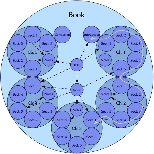
This diagram has been arranged to show not only the hierarchy, but also the intended use pattern of a typical, linear, non-fiction book.
- Continuity in the book is indicated by contact of the circles.
- The gray line, progressing in small and large clockwise arcs from section to section and chapter to chapter, demonstrates the linear progression of the content.
- The dashed black arrows show some possible non-linear paths that may be traveled by the reader to view content that is not part of the main linear flow of the book.
The goal of displaying the use of the book, and not merely the hierarchy, has led to an atypical diagram that conveys more knowledge than the typical counterpart.
I created this diagram in the fall of 2003. It appears in my thesis, and was selected to be supporting material for the book The Practical Guide to Information Design, by Ronnie Lipton.
12
Oct
Generation of Complex Diagrams: How to Make Lasagna Instead of Spaghetti
Update 2011: Many of the ideas in this thesis have evolved and been carried over into my book Designing Data Visualizations.
My master’s thesis is a system for creating good diagrams. It starts with the basics of perception and cognition, and walks the reader through the process of making appropriate choices for their particular design problem.
From the abstract:
This thesis presents a system for the generation of complex diagrams. “Complexity†is defined as a measure of distinct data types that are independently visually encoded. Diagrams representing four or more types of data are defined as complex, while diagrams representing three or fewer are simple. Successful generation of complex diagrams is dependent on appropriate design choices. Five fundamental principles are introduced to guide the choices made by the diagram designer. The two contextual fundamental principles are “different goals require different methods,†addressing the needs of the diagram designer, and “audience brings context with them,†addressing the needs and context of the diagram reader. The three perceptual fundamental principles are the “principle of information availability,†which guides the selection and density of the diagram elements, the “principle of semantic distance,†which guides the spatial placement and grouping of the diagram elements, and the “principle of informative changes,†which guides the visual encoding of the diagram elements. A review of the diagram design process, comprising selection, encoding, and placement of the diagram components, is given. For each phase of the design process the influence of the appropriate fundamental principles is discussed, and the fundamental principles are extended into applied guidelines and suggestions.