3
Jan
Why Apple isn’t worried about iPad competitors
In a New York Times article entitled Rivals to the iPad Say This Is the Year, makers of would-be iPad competitors reveal their strategy. Tablet manufacturers “who have discussed their plans say they will both offer specific features that the iPad is lacking, and undercut their competitors on price.” (Emphasis mine.)
Reading this gave me a flashback to almost five years ago, when Samsung released an mp3 player that they hoped would compete with the iPod. It was a good product, and it was doomed to fail. David Pogue nailed it:
The iPod’s competitors have wasted years of opportunity by assuming that they can beat the iPod on features and price alone. They’re wrong.
In fact, at least six factors make the iPod such a hit: cool-looking hardware; a fun-to-use, variable-speed scroll wheel; an ultrasimple software menu; effortless song synchronization with Mac or Windows; seamless, rock-solid integration with an online music store (iTunes); and a universe of accessories. Mess up any aspect of the formula, and your iPod killer is doomed to market-share crumbs.
I predict that history will largely repeat itself. Apple doesn’t win because they provide more features, they win because they provide a more intentional design that results in a better experience. Many other tablets will be sold and loved (my friends love their Samsung Galaxy Tabs), but no device will present a credible threat to the iPad’s market dominance until it offers a similarly intentional, compelling, and coherent experience.
8
Apr
UI FAIL
Unfortunately, you can’t click anywhere below to get to the categories explained there, and instead must find the category in the pulldown menu above. Terrible.
12
Mar
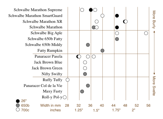
Tire selection chart
This is a short story of user experience, information visualization, and design choices. I like Rivendell Bicycle Works for a lot of reasons (see below). However, one thing they don’t do particularly well is allow you to compare products on their web site.
When comparing a few randomly sorted parts, such as rear deraillers, looking at all 3 or 4 choices and then choosing one is relatively easy. When the choice is among 16 tire models in three rim diameters, various widths, some with various features (kevlar bead, anti-puncture, etc.), spread across three pages, in no particular* order, doing a comparison and then confidently choosing one is really, really difficult.
To address this sub-optimal user experience issue, I created this chart to make life easier for customers, improve the interface for comparing the tire offerings, and hopefully improve sales.

It allows the (potential) customer to quickly focus on the appropriate tires(s) based on desired rim size, tire width, and toughness/quickness, and then click the chart to go directly to the tire’s page. (Note that some of these links are going to break as the selection of tires for sale changes.) keep reading…
1
Jun
Pixel rulers in Visio
Should you be required to work in Visio, you may well find yourself, as I did, wishing to measure your drawing in pixels. I couldn’t figure out how do do it, though Visio does support such diverse measurements as Ciceros and Didots.
I finally found the definitive answer from Microsoft: For some types of drawings, you may want to change the measurement units to pixels. However, a pixel isn’t a unit of measurement. A pixel is just a dot on a screen and the size of the dot varies for different screens. To simulate pixels, set the measurement units to points.
Needless to say, this is not satisfying. It’s true a pixel is only an on-screen measure, and is clearly only useful for a few, obscure situations, such as when creating interface mockups, wireframes, or prototypes for software, the web, or any other sort of images meant to be viewed on a screen.
Luckily, Visio provides a set of features that allow a fairly simple, two step work-around. Warning: doing this on existing Visio documents may severely distort your existing drawings. I suggest working on duplicate files, not originals. keep reading…
28
Jan
Multi-touch: Why the iPhone Matters
The introduction of the iPhone heralded the mainstreaming of a new interface paradigm. Features and form factor aside, the multi-touch interface represents the first major interface change since the introduction of the Macintosh GUI in 1984, and a notable shift in the right direction.
Twenty years ago, Donald Norman described the relationship between a control and its effect as mapping. “Natural mapping, by which I mean taking advantage of physical analogies and cultural standards, leads to immediate understanding.†(Norman, D. 1990. The Design of Everyday Things. Doubleday/Currency. P23.) Unfortunately, when there is not a “natural mapping,†understanding is anything but immediate.
Technology interfaces are difficult to design and learn because interfaces have moved further and further away from natural mappings. When the tool in question is an axe or a spoon, the relationship between the control and its effect is clear and direct. Similarly, for simple mechanical tools such as food grinders, adjustable wrenches, latches, and the like, it’s not too difficult to divine the function with no documentation. The interface is inseparable from the tool or device, and the mapping is strong. keep reading…