7
Nov
Unbroken Excel
Because I mention it all the time, here’s Cole Nussbaumer‘s template for good Excel graphs, where she’s fixed all of the bad Excel defaults.

15
Sep
A quick redesign of useless graphs
After seeing a poor infographic re-posted, I briefly ranted on twitter:
Terrible presentation of data. The bars are OK, the rest is worthless. http://bit.ly/o76BOm @litmusapp #fb #li
I don’t mean to be harsh, but #infovis culture needs constructive critique to improve, not just reposting. /cc @visualizingOrg @litmusapp
To put my mouse where my mouth (well, keyboard) is, I present two quick & dirty re-drawings, with commentary, of the first two sections of the poor infographic.

In both of these sections, an aesthetically pleasing, but not-very-functional, donut graph has been used. In both cases, it’s the wrong choice, though for different reasons.
keep reading…
12
Sep
New book: Designing Data Visualizations
I’m thrilled to announce my latest book, Designing Data Visualizations.
The goal of this book is to teach you the process of designing a visualization, presenting the important considerations, and informing the choices that you make. It’s tool-agnostic, and is entirely applicable to visualizations with high and low volumes of data, and to both quantitative and qualitative visualizations.
I was fortunate to have Julie Steele as my co-author on this book. Julie was the lead editor and a contributor to Beautiful Visualization.
The origins of my thinking on this topic lie in the work I did on my master’s thesis. This book benefits from an additional five years of experience and research on my part, as well as Julie’s vital insight, knowledge, and contributions.
For this book, we (the authors) are recommending the electronic version over the print version, as that will allow you easy access to updates and revisions as we add more examples and such. Also, the print edition will sadly be only in grayscale, whereas the electronic version will be full-color.
Update: looks like we’ll be providing a full-color download of the images so that people who buy the print edition don’t miss anything.
We’re very excited about this book. We hope you will be too.
12
Mar
Tire selection chart
This is a short story of user experience, information visualization, and design choices. I like Rivendell Bicycle Works for a lot of reasons (see below). However, one thing they don’t do particularly well is allow you to compare products on their web site.
When comparing a few randomly sorted parts, such as rear deraillers, looking at all 3 or 4 choices and then choosing one is relatively easy. When the choice is among 16 tire models in three rim diameters, various widths, some with various features (kevlar bead, anti-puncture, etc.), spread across three pages, in no particular* order, doing a comparison and then confidently choosing one is really, really difficult.
To address this sub-optimal user experience issue, I created this chart to make life easier for customers, improve the interface for comparing the tire offerings, and hopefully improve sales.

It allows the (potential) customer to quickly focus on the appropriate tires(s) based on desired rim size, tire width, and toughness/quickness, and then click the chart to go directly to the tire’s page. (Note that some of these links are going to break as the selection of tires for sale changes.) keep reading…
23
Jan
Clarifying a graph
A JK Galbraith column at Mother Jones includes the following graph, with this caption: What a dollar of stimulus puts back into the economy when spent on…

There are two related ways in which this graph fails to serve its purpose. keep reading…
1
Oct
Multi-poll tracker
The Takeaway has a clever interactive graph, showing the summary from a different poll or tracking web site on each row, and the states as columns. Column width reflects the number of electoral votes for that state. It’s a good way to get an aggregate view of what’s going on, as each source is a little different.
They’ve done a great job with this; it’s a great presentation of a ton of information abstracted in a constructive manner. The key issues (weight and inclination of each state) are present, with very little else to get in the way.
There are a few changes I’d make. The mouseover key is a little awkward, as it obstructs a lot of the image. I probably would have gotten rid of it altogether, and put the state info in the footer, as they’ve done with the poll name and score. I probably also would have put the score for each row in the row, either at the left, near the icon, or in a rightmost column, rather than forcing you to mouseover each column.
18
Sep
More economic charts
A few more bits of visual goodness related to dollars and sense for this election season.
===
Freakonomics has a nice follow-up to the Washington Post graphic below, showing two slightly different versions that are optimized to see the breakdowns in numbers of people and percent of tax income related to each segment. Great stuff. Go check it out.
(Via Tim O’Reilly’s twitter)
===
Digital Roam has a whole series of hand-drawn micro-graphs showing economic activity and indicators for the Bush and Clinton administrations. Clear, simple, and very compelling.
4
Sep
Tax Policy Graphs
The Washington Post has published this excellent graphic comparing the proposed tax policies of the two mainstream candidates. It does a great job of clearly contrasting the impact per tax-bracket in terms of percent and average change in tax burden.
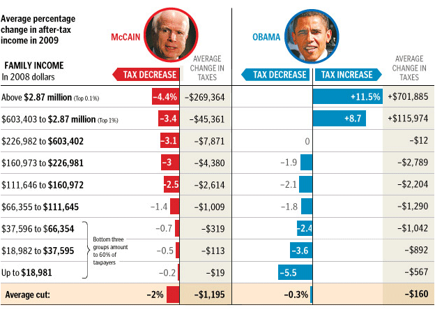
Click through for their brief commentary. (And note that it’s brief because the graph does a good job of saying it all.)
29
Jun
The Electoral Vote Race
Electoral-Vote.com is an excellent and popular site for tracking polls for president on a state by state basis. One of the nice features is a historical graph that shows the changing number of electoral votes for each candidate over the election season.
Currently it looks something like this:
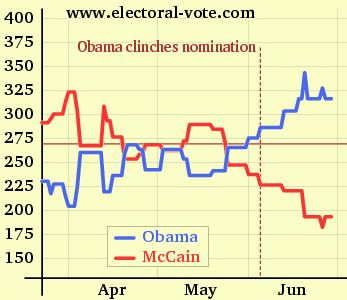
(click to see the original on electoral-vote.com)
Just for fun, I decided to see what it would look like showing the candidate totals as a single shared line. keep reading…
4
Apr
Zillow diagram of market segment value changes
Zillow has posted a series of excellent diagrams which show relative changes in assorted housing markets, broken down by segment. Their diagrams are very clear and allow fairly quick access to a lot of good information. Please go explore there, and then come back here for my commentary. keep reading…