29
Jun
The Electoral Vote Race
Electoral-Vote.com is an excellent and popular site for tracking polls for president on a state by state basis. One of the nice features is a historical graph that shows the changing number of electoral votes for each candidate over the election season.
Currently it looks something like this:
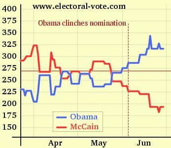
(click to see the original on electoral-vote.com)
Just for fun, I decided to see what it would look like showing the candidate totals as a single shared line. (This is similar to the epic graph representing the Senate History Timeline.)
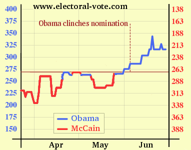
In the revised version, the vertical axis counts votes for Obama going upward, as in the original, and votes for McCain going downward. The axis labels are color coded to reflect the candidate they represent. The color of the line reflects the candidate with more votes for that time period.
Theoretically, when the votes total line is above the 271 line, Obama is ahead; when it’s below the 271 line, McCain is ahead. However, the revision isn’t perfect, and accuracy suffers relative to the original in a few ways.
- In situations where a state (such as Florida) is tied, neither candidate is credited with the votes, so the total number fluctuates. This is not handled well in the revision.
- It’s a little trickier to represent the situation when the count is very near 270 (see late April and early May in the original).
- Because the total number of electoral votes is 538, it’s impossible to use round numbers at both ends of the shared grid lines.
While not a superior solution overall, the revised version does have some merit. As a rough tool for observing trends, I think a single line is cleaner, easier to follow, and the changing colors are a little easier to tell a story with.

No Comments
No comments yet.
RSS feed for comments on this post.
Sorry, the comment form is closed at this time.