1
Jun
Pixel rulers in Visio
Should you be required to work in Visio, you may well find yourself, as I did, wishing to measure your drawing in pixels. I couldn’t figure out how do do it, though Visio does support such diverse measurements as Ciceros and Didots.
I finally found the definitive answer from Microsoft: For some types of drawings, you may want to change the measurement units to pixels. However, a pixel isn’t a unit of measurement. A pixel is just a dot on a screen and the size of the dot varies for different screens. To simulate pixels, set the measurement units to points.
Needless to say, this is not satisfying. It’s true a pixel is only an on-screen measure, and is clearly only useful for a few, obscure situations, such as when creating interface mockups, wireframes, or prototypes for software, the web, or any other sort of images meant to be viewed on a screen.
Luckily, Visio provides a set of features that allow a fairly simple, two step work-around. Warning: doing this on existing Visio documents may severely distort your existing drawings. I suggest working on duplicate files, not originals.
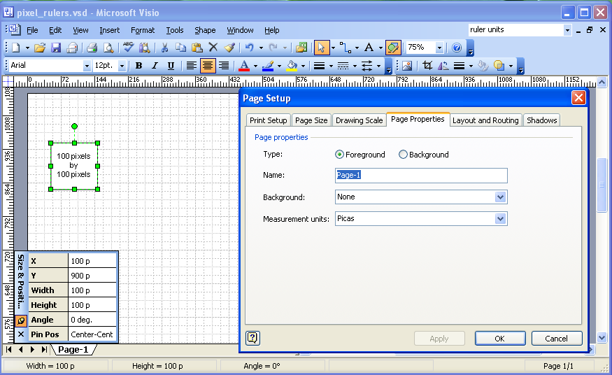
Step One Open the File > Page Setup menu and select the Page Properties tab. In the Measurement units field select Picas.

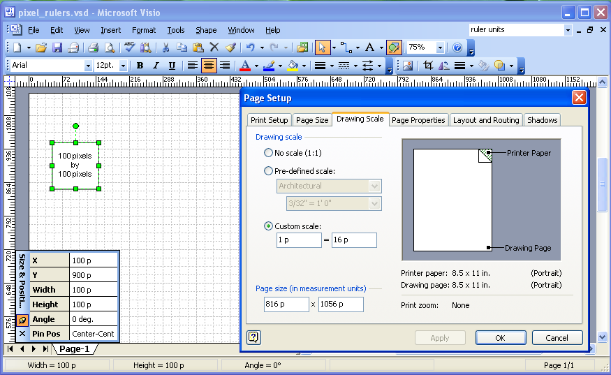
Step Two In the same dialog box, select the Drawing Scale tab. Select the Custom Scale radio button and set the ratio to 1 p = 16 p.

That’s it. Click OK and you’re all set to go.
Why it works Picas are 6 to the inch. By setting the ratio at 1:16, Visio presents a diagram at 96 picas per inch, the same as the Windows standard of 96 pixels per inch. You could set an appropriate ratio with any of the available units, but it works well with picas, and I find it useful that all units are labeled as p.
Here is a Visio file template with the units set properly.
Thanks, Noah.
This is what I was exactly looking for.
Comment by Shajahan Mohammed — June 14, 2008 @ 1:29 pm
How do you deal with fonts? I changed my fonts to picas, but they don’t seem to be responding to the drawing scale changes.
This was a great tip by the way.
Comment by Allen — July 15, 2008 @ 2:09 pm
Allen,
Are you adjusting existing drawings, or starting fresh? Things get weird when adjusting the scale of existing drawings. I don’t recall having issues with drawings that were scaled this way initially.
Thankfully, I’m using Fireworks for my wireframes these days, so I don’t have immediate recall about the font behaviors.
Cheers, Noah
Comment by Noah — July 15, 2008 @ 5:47 pm
These are new drawings. For example, I create a new file with the units and scale set as you specify. Then I want to put some type in the page. I set the units on type to picas, and when I put the type in the page, I don’t feel like I’m getting any useful information about it. 1 pica type doesn’t look like 1 pixel type whereas the graphics that I’m laying down are pixel perfect.
Once again, thanks for the great suggestion.
-Allen
Comment by Allen — July 16, 2008 @ 6:24 am
Allen,
My suspicion is that because Visio isn’t a proper layout program, it’s not scaling the fonts at all, and is displaying them at the native size regardless of the document measure and scale. In the work where I discovered this hack, exact font size wasn’t an issue and rough spacing was close enough.
For pixel-perfect diagrams I strongly suggest using OmniGraffle (Mac only), and for interface mockups and wireframes I suggest using Adobe Fireworks. Both programs offer free 30 day trial periods to see if you like them, and both are well documented and supported.
Good luck!
-Noah
Comment by Noah — July 16, 2008 @ 3:12 pm
Hmmmm….what happens with respect to the scale when you print something? My ideal would be to take your solution (which works on screen) and then be able to print such that the “actual” size on paper looks very very close to the size on screen. However, due to differences in resolution it ends up scaling down when printed.
Comment by Eric — March 11, 2009 @ 1:31 pm
Eric,
One issue here is that different models of display are going to have different resolutions. You can get a 17″ laptop with the same number of pixels as a 24″ widescreen monitor. Any “actual size” on paper is only “actual” for one specific resolution.
-Noah
Comment by Noah — March 11, 2009 @ 2:47 pm
Great tip, Noah.
This is what I found useful: copy/cut your original wireframes/diagrams, then adjust your settings. Paste it back. You’ll have to adjust the dimensions on the wireframes, but at least it’s distorted.
Comment by Steven Loi — July 29, 2009 @ 7:40 pm
[…] Pixel rulers in Visio « Complex Diagrams (tags: visio wireframe) […]
Pingback by links for 2009-08-04 « Giri’s Blogmarks — August 4, 2009 @ 10:03 am
Thank you! Exactly what I was looking for and it worked a treat!
Comment by Mark — August 26, 2009 @ 3:32 pm
Thanks very much. This is exactly what I needed.
Comment by Helen — October 5, 2009 @ 7:44 am
I’ve been using the ol’ pica-to-pixel trick, but am having trouble with some of the company stencils we use. Instead of displaying normally, shapes like scrolling text areas, drop-down lists, and radio buttons loose lines or other elements. Since they’re custom shapes, I imagine there’s something in the make-up of the shapes that causes this to happen. They hold their fidelity until the 1 to 16 scale is applied, then the weirdness ensues.
Has anyone else experienced this issue?
Comment by Daniel — July 16, 2010 @ 8:43 am
Hi Daniel,
As I mentioned in the warning above, this change does mess with existing shapes. I’m not sure what the best fix is. Perhaps try Steven’s suggestion?
Best, Noah
Comment by Noah — July 16, 2010 @ 11:14 am
Man, You saved my life!!! That’s great!!!! Thanks!!!!
Comment by Mongeff — December 7, 2011 @ 7:19 am
Thanks, that’s great… used your template in Visio 2010 for a web screen design and worked perfectly for managing size of final parts of the page
Comment by Mark Sze — February 3, 2012 @ 4:34 pm
Exactly what I needed. Amazing, four years later and this post is still helping people. Thanks man!
Comment by Rob — March 21, 2012 @ 8:10 am
[…] Pixel Rulers in Visio […]
Pingback by Visio Trick – Working in Pixels - iaWerks - Making the Web Usable One Page at a Timeâ„¢ — June 14, 2012 @ 9:57 pm