4
Sep
Tax Policy Graphs
By Noah | Add a comment |
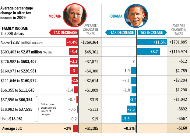
The Washington Post has published this excellent graphic comparing the proposed tax policies of the two mainstream candidates. It does a great job of clearly contrasting the impact per tax-bracket in terms of percent and average change in tax burden.
Click through for their brief commentary. (And note that it’s brief because the graph does a good job of saying it all.)
digg |
del.icio.us |
No Comments
No comments yet.
RSS feed for comments on this post.
Sorry, the comment form is closed at this time.
