23
Jan
Clarifying a graph
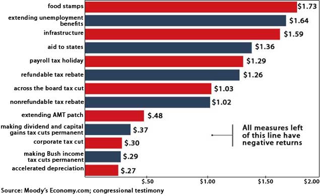
A JK Galbraith column at Mother Jones includes the following graph, with this caption: What a dollar of stimulus puts back into the economy when spent on…

There are two related ways in which this graph fails to serve its purpose. The first is that the colors fail to add any value. Alternating the rows is purely decorative, but doesn’t convey any information.
The second issue is that the break-even line is very ambiguous. It’s unclear which end of the T is the actual line (presumably the point above the $1.00 mark), and what purpose the balance of the T serves.
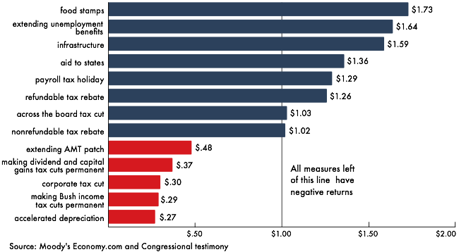
A quick re-drawing of the graph clarifies both of these issues.

The colors now indicate whether the net effect of the stimulus is positive or not. Additionally, the $1.00 line has been extended to the full hight of the gallery, giving an additional benchmark for the success of each program. The key message about negative returns has been moved close to the $1.00 line, with no callout line to confuse things.
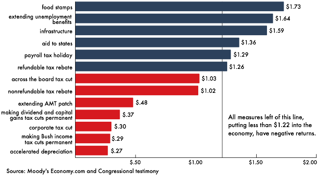
Update: this third version addresses changes suggested by comments to this post.

Every time I run across a bad graph, I want to send it to you for fisking.
Comment by Sanguinity — January 23, 2009 @ 10:20 pm
I’m pretty sure the break-even line is supposed to be around $1.22. The arrow to the left is saying ‘left of this vertical line’.
Comment by Josh Levenberg — January 24, 2009 @ 12:33 pm
The graph really ought to somehow show why that line is where it is and why some things are “negative returns”. Could be as simple as using values relative to the line’s value rather than 0.
Comment by fool — January 24, 2009 @ 1:14 pm
@Josh @fool
$1.22 makes sense. I didn’t parse the leftward horizontal line as an arrow, but as a point at the end of the line. Regardless, a full-height vertical rule strikes me as a better solution.
I’ve added a third version of the graph which moves the line and expands its explanation.
Comment by Noah — January 24, 2009 @ 2:08 pm
Good job, Noah.
Comment by Jon Peltier — February 3, 2009 @ 7:41 pm