15
Sep
A quick redesign of useless graphs
After seeing a poor infographic re-posted, I briefly ranted on twitter:
Terrible presentation of data. The bars are OK, the rest is worthless. http://bit.ly/o76BOm @litmusapp #fb #li
I don’t mean to be harsh, but #infovis culture needs constructive critique to improve, not just reposting. /cc @visualizingOrg @litmusapp
To put my mouse where my mouth (well, keyboard) is, I present two quick & dirty re-drawings, with commentary, of the first two sections of the poor infographic.
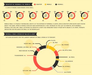
In both of these sections, an aesthetically pleasing, but not-very-functional, donut graph has been used. In both cases, it’s the wrong choice, though for different reasons.
Taken individually, the donuts in the first section aren’t bad: they’re dealing with a few wedges, and fine-grained comparison between wedges in the same donut isn’t necessary. These individual donuts are good for a glance at the relative share of the total market, and do a perfectly good job of it.
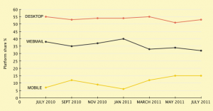
However, the first section is showing time series data that spans all seven donuts. Time series data is often best shown with a line graph. (Of course the best practice varies, depending on what exactly needs to be revealed.)
My redraw:

(click for full-sized image)
In this case, where small differences are relevant, the line graph shows the sequential changes more easily than can be seen by comparing similar wedges between donuts. (This is why the wedges all need to be labeled; the differences are too subtle to accurately discern.) The line graph also shows the trends more clearly, for the same reason: it’s much more clear at a glance which values are larger and smaller than others in the series.
In the second section, a donut graph is also used. While it is intended to show fractions of a whole (thumbs-up!), it fails two main tests to be the right choice for this data:
- it’s showing too many relevant wedges
- many of the wedges are very similarly sized
(Another major, though unrelated, flaw is the choice to sort in an non-standard manner: alphabetically-by-parent-company-except-microsoft, and then not telling us what the sort order is.) The result is a visualization where the visual properties don’t much help us do the actual task at hand: comparing the share of each client.
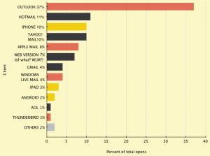
My redraw:

(click for full-sized image)
Here is a simple bar graph. It’s not nearly as visually exciting, but it’s much easier to actually extract knowledge from. I’ve used the standard sort order, by magnitude, but you could easily sort alphabetically or by company as well.
In both cases, the original donut graphs sacrifice efficiency and their ability to inform for the sake of aesthetics and novelty. As I’ve said before, successful visualizations have all of these characteristics, and aesthetics shouldn’t trump function. To learn more about how to design visualizations well, check out Designing Data Visualizations.

Is the original a eDraw template? Unfortunately people think these(meaning “they”) seem more polished and impressive. In effect, you get the common problem that people who are familiar with information don’t know how to present it to others, viewers get distracted by the graphics and shapes and so if they want to be through they have to figure through the “presentation layer” to make sense of it–some wouldn’t bother, some would discredit the source information, and some would only remember the shapes and colors. The original graphic works against the weaker parts of our memory and recall.
Comment by Christina — September 16, 2011 @ 10:30 am
@ Christina: No idea what format the original is. I totally agree. It was drawn by someone who was too close to the data and more concerned with shape than communication.
Comment by Noah — September 16, 2011 @ 10:33 am
Of course this Robert Kosara post is a good reference for how not to use a pie chart, which seems relevant for the original graphic: http://eagereyes.org/techniques/pie-charts
Comment by Greg, OOM Creative — September 17, 2011 @ 5:47 am
@ Greg: Good call. Robert Kosara is great, and that article is an excellent reference.
Comment by Noah — September 17, 2011 @ 9:46 am
I have a question about the use of color in the second diagram (the bar graph). I’m assuming you made the bars different colors to keep consistent with the original color scheme. However, I’m curious if you would have used this kind of color variation if you had been creating this graph from scratch. Unless I’m missing something, the colors in this particular graph have no meaning in terms of interpreting the data. I ask because I have an exec who always wants me to add colors to graphs like these (again, with no meaning behind them, but rather to add what he calls “visual interest”), and my bias is not to do so, with the assumption being that when people see color differences, they assume there’s some meaning behind them. Your thoughts?
Comment by Sara — March 12, 2012 @ 9:51 am
@Sara: Excellent question.
Yes, I kept the original colors, because the colors are meaningful, as they map back to the key from the first graph, the division between desktop, mobile, and web-based email clients. Some of that meaning is lost because I split the graphics into two images, thereby removing the proximity and correspondence. (Position & grouping matters. 😀 )
In terms of your exec, and people perceiving different colors to be meaningful you’re exactly right. Go get a copy of Kosslyn’s Graph Design for the Eye and Mind, and read aloud from page 17:
The Principle of Informative Changes
People expect changes to carry information.
The reader will interpret any change in the appearance of a display (changing the color or texture…) as conveying information.
It’s a great book, packed full of applied guidance for this sort of thing.
Good luck!
Comment by Noah — March 12, 2012 @ 10:04 am