20
Dec
Great visualization: Pro-football game charts
By Noah | Add a comment |
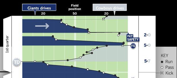
From Chartball.com: Pro-football game charts.

They’ve done an excellent job here, visually representing:
- direction of play
- position of each down
- game time on the vertical axis
- type of play (run, pass, kick)
- scoring events
- other events, such as fumbles and intercepts
Great use of the field metaphor and direction, as well as team colors. I’d like to see what this looked like with encodings for the downs (shape for type of play, and down encoded by saturation?), but overall it’s excellent. And I should note that the detailed information on each play is available when you mouse-over each event.
digg |
del.icio.us |
This is very cool. One interesting thing that comes naturally out of this representation is a clear view of time of possession using the area of the shaded regions. It’s very clearly that the Giants had long scoring and maintained possession, while the Patriots had much quicker drives. I happened to watch this game 😉 and time of possession was a critical factor in the outcome.
Comment by Noah Z — April 5, 2012 @ 9:47 am