12
Oct
Hierarchy of a Book
By Noah | Add a comment |

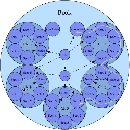
This diagram has been arranged to show not only the hierarchy, but also the intended use pattern of a typical, linear, non-fiction book.
- Continuity in the book is indicated by contact of the circles.
- The gray line, progressing in small and large clockwise arcs from section to section and chapter to chapter, demonstrates the linear progression of the content.
- The dashed black arrows show some possible non-linear paths that may be traveled by the reader to view content that is not part of the main linear flow of the book.
The goal of displaying the use of the book, and not merely the hierarchy, has led to an atypical diagram that conveys more knowledge than the typical counterpart.
I created this diagram in the fall of 2003. It appears in my thesis, and was selected to be supporting material for the book The Practical Guide to Information Design, by Ronnie Lipton.
digg |
del.icio.us |
No Comments
No comments yet.
RSS feed for comments on this post.
Sorry, the comment form is closed at this time.