13
Oct
Exposition of Threads in a Speech
The public presentation of a speech (when unsupported by visual aids) is an interesting form of discourse because it contains little-to-no explicit structure. Typically, a speech is delivered (or read) with very few indications of structure presented to the listener (or reader). Because they are designed to be spoken aloud and heard, there are no chapter titles or section headings in the text. At best, the speaker may pause to indicate a change of topic, or reveal a bit of structure by saying “now I’m going to talk about,†or, “let me give you an example.â€
However, there is structure present in a speech. The speaker must present evidence or examples to support their goals, whether their goals are to persuade, inform, or entertain. They may also draw conclusions, ask relevant questions, or predict, all based on their evidence and conclusions. In order for the speech to be successful, the evidence, conclusions, and predictions must be logically tied together to build a coherent argument. In a well-crafted speech, the audience will have no trouble following the thread of the argument, despite the lack of explicit structure. However, if there is more than a small amount of content in the speech, the audience may not have the ability to rank the importance of various ideas, or even to identify the key concepts.
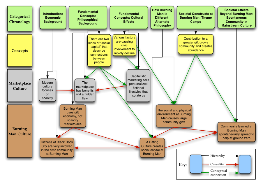
This is a diagram I created of the first half of the speech Viva Las Xmas [PDF, HTML] by Larry Harvey (2002), the founder of the Burning Man project. In the speech, he discusses some socioeconomic principles, and how they affect interactions between people in a marketplace economy, and also in the gift economy at Burning Man. The diagram uses placement, color, and links to show not only the chronology, hierarchical, and topical groupings of chunks of the speech, but also causality and conceptual connections among the chunks.
This has some significant consequences. Not only does the diagram immediately reveal the topical threads in the speech, it also makes the important concepts clear by virtue of their relatively high number of links to other portions of the speech. The connections, relationships, and implications that are implicit in the speech become explicit in the diagram, thereby conveying more complete knowledge to the reader, reducing the amount of raw information that they have to integrate, and making the actual message of the speech more accessible. This type of diagram could be constructed before the presentation of a speech, and then used to support the speech as it was being delivered. This would enable the speech author to emphasize the key points and make the speech easier to follow. This diagram reveals six dimensions of complexity.
- hierarchical membership, indicated by the horizontal position below the green boxes and redundantly encoded with the vertical black arrows
- topical grouping, indicated by the vertical position and redundantly encoded by color
- specific chunk, indicated by the text in each box
- chronological sequence, indicated by relative left to right position
- causality, indicated by red arrows
- conceptual connection, indicated by green arrows
I created this diagram in the fall of 2003. The diagram and the text of this post appear in my thesis.
Comments temporarily disabled due to spam.

Neat!
Flowcharts…I taught myself the Visio program at the last job I had (working for someone else) and then did a presentation to teach it to the client. My chart was simple but fun – a chocolate chip cookie recipe, with options and the client had fun re-creating it themselves. Teehee.
I love these types of charts. They are so cool and you can have lots of fun with colors and shapes while also doing useful and helpful things like making sense of information.
Rock on!
Comment by Amy Woidtke — December 6, 2007 @ 8:45 am