24
Jan
Properties and Best Uses of Visual Encodings
By Noah | Add a comment |
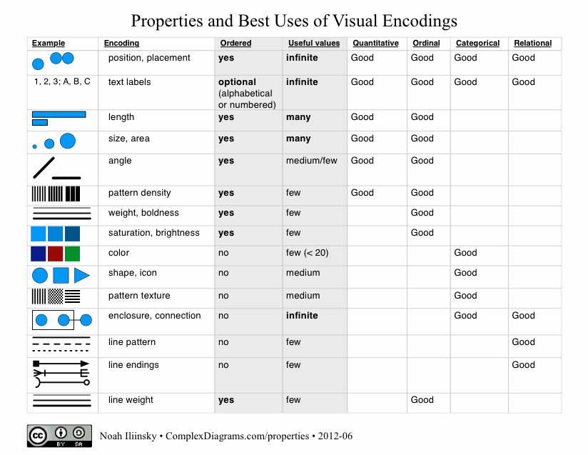
Here’s my table of properties and best uses of visual encodings. Feel free to download the PDF.
Update September 25, 2013: I wrote a whitepaper for IBM that explains the use of the table.
Please note that I’m not the first person to create a table like this, this just happens to be my take on it. I got my first glimpse at this sort of table in Jock Mackinlay‘s PhD thesis from 1986.
A really nice table comparing inclusion of visual properties/attributes in tables has been put together by Richard Brath.
digg |
del.icio.us |

Angle is tricky because past a certain angular resolution, it is less immediately (or accurately) grasped by the subconscious, so while they can technically be used for interval and ratio values, they are most useful for small ordinal (i.e. almost categorical) datasets. Coupled with the innate human inability to accurately perceive relative angles, they are not that great even if the viewer does commit to serious conscious processing of the graphic.
So, while I think “medium” is probably an accurate rating for it, it might warrant an asterisk or a footnote…
Comment by Peter Wang — January 27, 2012 @ 8:45 pm
Peter, yes agreed. We can get at least 12 different quantitative values quite easily (such as on the face of a clock). Beyond that, increments are likely more ordinal than accurate. I’ll update the next version.
Comment by Noah — January 28, 2012 @ 10:31 am
… and the new version is posted, both the gif and pdf.
Comment by Noah — January 31, 2012 @ 1:11 pm
I’m very late to this thread, but I wonder why you gave color a vote of “no” in the Ordered category? Would you not consider the the red-oranage-yellow (etc) spectrum to be “ordered”?
Comment by John — December 5, 2012 @ 12:13 pm
Hi John,
That’s an excellent question, I’m glad you asked. As you point out, color is absolutely ordered in the physical world, as well as by social convention. However, it’s not perceived as ordered by the brain, in the way that properties like size and position are perceived as ordered. People will not consistently say blue is bigger than yellow, or green comes before orange. Because of that, for best results, color should be used for categorical labeling but not for ordered labeling.
Thanks!
-Noah
Comment by Noah — December 8, 2012 @ 5:54 pm
I’m wondering why you think line weight has very few uses? I’m thinking of showing the degree of frequency or strength in connection in networks. what are your thoughts?
Comment by Poppe — February 27, 2013 @ 8:23 am
Great question. While there are a huge number of line weights possible to print or display, our ability to clearly discern small differences between them isn’t great (hence “useful”). You might be able to see the difference between 2 and 4 pixels wide, but you’ll have a hard time seeing the difference between 37 and 41 pixels wide, especially for lines that aren’t close to each other. That said, if you don’t need that degree of precision, line weight is an excellent choice for use as you’re describing it.
Comment by Noah — February 27, 2013 @ 8:44 am
I’m curious. Could ‘line weight’ not also be considered for ‘relational’ along with ‘line pattern’ and ‘line ending’?
Comment by Halpenfield visualisation tools — January 13, 2014 @ 4:09 am
Hi Halpenfield,
I suppose it could, though we tend to associate thickness with magnitude (this one is bigger / more than that one), while things like pattern and ending more indicate “these are different.”
Comment by Noah — January 13, 2014 @ 11:02 am
Just wondering if there is there a delineation that can be used to determine if a data field is oriented to ordinal vs relationship. After reading your paper, you mention that ordinal is used for rank where relationship is used for grouping or hierarchy. Doesn’t a hierarchy imply a rank? That being said, could a structure such as gold-silver-bronze be classified as a relationship as well?
Comment by Tom — January 25, 2016 @ 11:04 am