1
Jun
Pixel rulers in Visio
Should you be required to work in Visio, you may well find yourself, as I did, wishing to measure your drawing in pixels. I couldn’t figure out how do do it, though Visio does support such diverse measurements as Ciceros and Didots.
I finally found the definitive answer from Microsoft: For some types of drawings, you may want to change the measurement units to pixels. However, a pixel isn’t a unit of measurement. A pixel is just a dot on a screen and the size of the dot varies for different screens. To simulate pixels, set the measurement units to points.
Needless to say, this is not satisfying. It’s true a pixel is only an on-screen measure, and is clearly only useful for a few, obscure situations, such as when creating interface mockups, wireframes, or prototypes for software, the web, or any other sort of images meant to be viewed on a screen.
Luckily, Visio provides a set of features that allow a fairly simple, two step work-around. Warning: doing this on existing Visio documents may severely distort your existing drawings. I suggest working on duplicate files, not originals. keep reading…

5
May
Harvard Business Review on infovis
The Harvard Business Review has published an article by researchers from IBM’s Many Eyes project, discussing the benefits of good information visualization.
A choice quote:
Our research has found that the compelling presentation of data through visualization’s advanced techniques generates a surprising volume of impassioned conversations… That level of engagement could foster the kind of grassroots innovation CEOs dream of.
Hopefully this will help increase corporate interest in information visualization.
(via Information Design Watch)
Comments temporarily disabled due to spam.
29
Apr
Video of my Ignite talk
This is the talk I gave at Ignite Seattle 5, February 19, 2008. The Ignite format requires presenting 20 slides in 5 minutes, with the slides advancing every 15 seconds whether the presenter is ready or not. The original name for this format was “Ask Later.”
4
Apr
Zillow diagram of market segment value changes
Zillow has posted a series of excellent diagrams which show relative changes in assorted housing markets, broken down by segment. Their diagrams are very clear and allow fairly quick access to a lot of good information. Please go explore there, and then come back here for my commentary. keep reading…
7
Mar
Humorous pop-culture visuals: Song Charts
I was just introduced to the Song Chart group group on Flickr. It’s full of visualizations of song lyrics. Many are clever, many are hilarious. This is my contribution.
5
Mar
Group interview at VizThink
Jeff Parks led a discussion about the conference and visual thinking in industry among a few of us at VizThink in January.
It’s now posted at Boxes and Arrows. He notes that the iTunes version lets you jump among the chapters using the Chapters menu.
21
Feb
Podcast: Interviewed by Tom Crawford of VizThink
Here’s a podcast/webinar of me being interviewed by Tom Crawford, who runs the VizThink conference. He asked some good questions. It was a lot of fun.
There’s a video version showing the example diagrams, as well as an audio-only version.
16
Feb
Presenting at Ignite Seattle
This Tuesday, February 19th, I’ll be one of several presenters at Ignite Seattle. Come if you can; it will be a good time.
28
Jan
Multi-touch: Why the iPhone Matters
The introduction of the iPhone heralded the mainstreaming of a new interface paradigm. Features and form factor aside, the multi-touch interface represents the first major interface change since the introduction of the Macintosh GUI in 1984, and a notable shift in the right direction.
Twenty years ago, Donald Norman described the relationship between a control and its effect as mapping. “Natural mapping, by which I mean taking advantage of physical analogies and cultural standards, leads to immediate understanding.†(Norman, D. 1990. The Design of Everyday Things. Doubleday/Currency. P23.) Unfortunately, when there is not a “natural mapping,†understanding is anything but immediate.
Technology interfaces are difficult to design and learn because interfaces have moved further and further away from natural mappings. When the tool in question is an axe or a spoon, the relationship between the control and its effect is clear and direct. Similarly, for simple mechanical tools such as food grinders, adjustable wrenches, latches, and the like, it’s not too difficult to divine the function with no documentation. The interface is inseparable from the tool or device, and the mapping is strong. keep reading…
7
Jan
Shopping cart map
Visiting unfamiliar contexts can lead to interesting discoveries. In this case I’m in Williamsburg Virginia, and was impressed that a regional grocery chain, Bloom, had store maps mounted on their shopping cart handles. Brilliant.
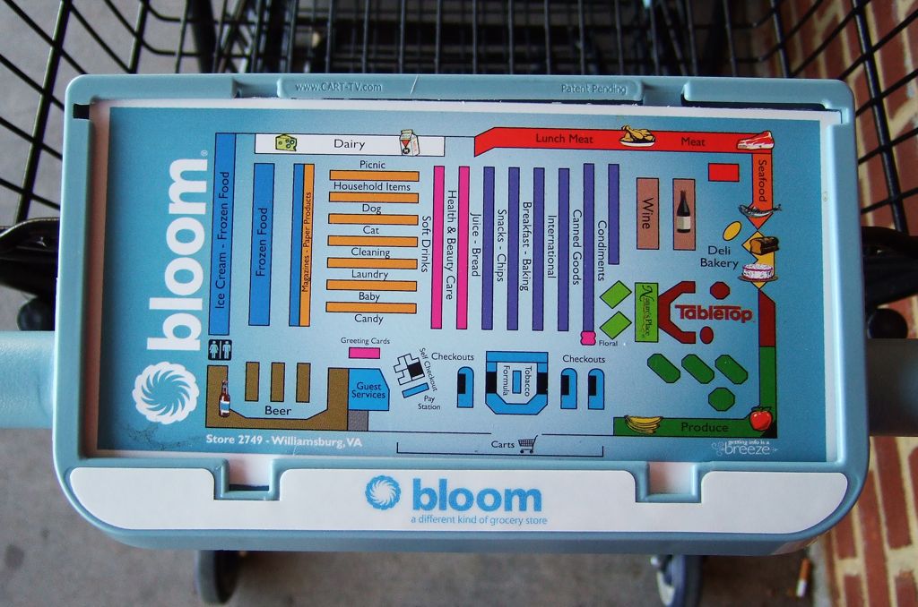
(click for full sized image)
A quick google for them reveals a blurb where they characterize their stores as “uncomplicated” and “hassle-free.” Their aim for a positive customer experience seems to be yielding some good ideas.