26
Feb
VizThink wrap-up and notes
VizThink ’09 was awesome. I’ve come back exhausted, energized, and inspired, with a load of new ideas.
Thanks to everyone who presented, who attended my sessions, who asked good questions in all situations, who I talked with and listed to and shared meals with. It was a fantastic time. Special thanks goes out to the crew (and families of!) who put on the conference; I appreciate your hard work and perseverance.
As promised, here are the documents that support my sessions. The best online version of my User-Centered Information Design talk is the version from Infocamp ’08, which includes narration. The only slides missing from that presentation are the design process guidance slides, which I’ve made into a handy PDF.
The snapshot talk on visualizing complexity was supported by this document.
As always, I’d love to hear from you about what worked, what didn’t, lingering or new questions, and anything else on your mind.

12
Feb
Bourbon-molasses Supernatural Brownie recipe
[I’m justifying posting a recipe here with the thinking that good food is a good user experience.]
These are my favorite brownies. The recipe is shamelessly stolen (and modified) from the The New York Times and The Splendid Table. See those sites for advice on using baking parchment, fancy unpanning, adding nuts (blasphemy!) or frosting, etc. My additions and notes start with an *.
keep reading…
19
Jan
Configuring IMAP for Gmail, Apple Mail.app, and iPhone (and iPod touch) (and probably iPad)
Update 5, December 2011: This appears to work for Apple Mail 5 under Lion / OSX 10.7 as well.
Update 4: Step 1.1 is no longer necessary, due to updates in gmail.
Update 3: Sounds like iOS4 addresses some of this with an archive/delete toggle for gmail, as pointed out in the comments.
Update 2: I suspect these instructions will work on an iPad as well as iPhones and iPod touches, but they haven’t been verified. If anyone with an iPad can verify, please post. Thanks!
Update: This post is all about how to get messages to actually delete from gmail when you delete them in Maill.app or on your iPhone, rather than having deleted messages saved in the archive, As Google Intended. If you like the idea of saving every message forever in the gmail archives, their setup instructions are 100% correct and you don’t need this post.
===
This post was spawned by my frustrations with gmail, and my inclinations to save other people the effort of having to figure it out on their own.
Introduction: IMAP, Gmail, and You
IMAP is a mail protocol that allows continuous synchronization between a mail host and one or many clients; this is a Very Good Thing. For more on IMAP and why you should want to use it, see Google’s introduction, and the first part of this post at TechnoLawyer.
Gmail approaches mail differently than most mail hosts/providers. Rather than filing messages into single folders, messages can be tagged with any number of tags. The advantage of tags over folders is that a single message can be filed in multiple places, each one associated with a different tag. The Inbox is treated as another tag by Gmail. An unfortunate side-effect of this is that when most IMAP clients (mail applications) attempt to delete a message, Gmail removes the Inbox tag, but does not delete the message. The message remains in the archive for that account, and can been seen in the All Mail view. The only exceptions to this behavior are messages in Gmail’s Trash or Spam views; these messages do not appear anywhere else. When they are deleted from Trash or Spam they are gone forever. (Here’s a conceptually useful table of Gmail’s default interactions with IMAP client actions)
It is possible to configure Gmail and Apple’s Mail application to appropriately delete messages from Gmail when they are deleted in Mail. These instructions also show how to store all drafts and saved messages on the Gmail server, and how to configure your iPhone for the same behaviors. keep reading…
14
Oct
Infocamp 2008 Presentation
This is the slideshow and audio from my Infocamp 2008 presentation on User-Centered Information Design.
The audio synchronization seems to work when played straight through, but not when you manually advance the slides.
1
Jun
Pixel rulers in Visio
Should you be required to work in Visio, you may well find yourself, as I did, wishing to measure your drawing in pixels. I couldn’t figure out how do do it, though Visio does support such diverse measurements as Ciceros and Didots.
I finally found the definitive answer from Microsoft: For some types of drawings, you may want to change the measurement units to pixels. However, a pixel isn’t a unit of measurement. A pixel is just a dot on a screen and the size of the dot varies for different screens. To simulate pixels, set the measurement units to points.
Needless to say, this is not satisfying. It’s true a pixel is only an on-screen measure, and is clearly only useful for a few, obscure situations, such as when creating interface mockups, wireframes, or prototypes for software, the web, or any other sort of images meant to be viewed on a screen.
Luckily, Visio provides a set of features that allow a fairly simple, two step work-around. Warning: doing this on existing Visio documents may severely distort your existing drawings. I suggest working on duplicate files, not originals. keep reading…
29
Apr
Video of my Ignite talk
This is the talk I gave at Ignite Seattle 5, February 19, 2008. The Ignite format requires presenting 20 slides in 5 minutes, with the slides advancing every 15 seconds whether the presenter is ready or not. The original name for this format was “Ask Later.”
7
Mar
Humorous pop-culture visuals: Song Charts
I was just introduced to the Song Chart group group on Flickr. It’s full of visualizations of song lyrics. Many are clever, many are hilarious. This is my contribution.
13
Oct
Exposition of Threads in a Speech
The public presentation of a speech (when unsupported by visual aids) is an interesting form of discourse because it contains little-to-no explicit structure. Typically, a speech is delivered (or read) with very few indications of structure presented to the listener (or reader). Because they are designed to be spoken aloud and heard, there are no chapter titles or section headings in the text. At best, the speaker may pause to indicate a change of topic, or reveal a bit of structure by saying “now I’m going to talk about,†or, “let me give you an example.â€
However, there is structure present in a speech. The speaker must present evidence or examples to support their goals, whether their goals are to persuade, inform, or entertain. They may also draw conclusions, ask relevant questions, or predict, all based on their evidence and conclusions. In order for the speech to be successful, the evidence, conclusions, and predictions must be logically tied together to build a coherent argument. In a well-crafted speech, the audience will have no trouble following the thread of the argument, despite the lack of explicit structure. However, if there is more than a small amount of content in the speech, the audience may not have the ability to rank the importance of various ideas, or even to identify the key concepts.
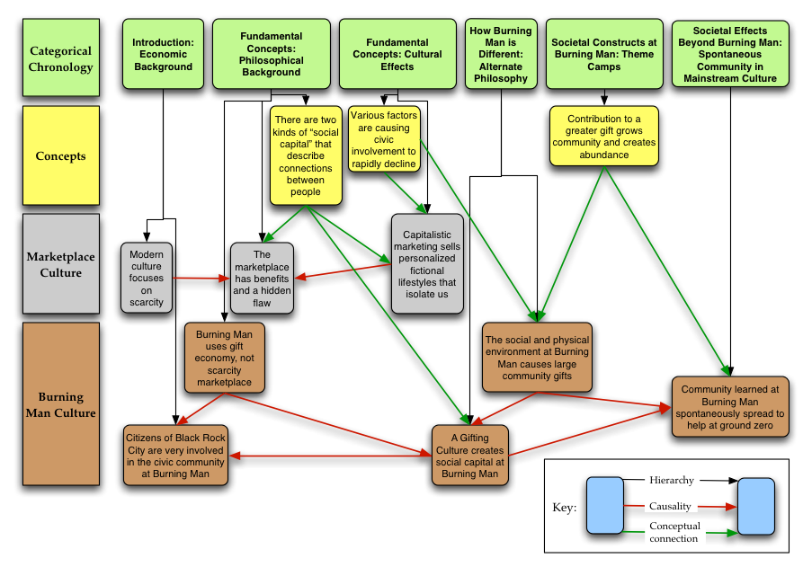
This is a diagram I created of the first half of the speech Viva Las Xmas [PDF, HTML] by Larry Harvey (2002), the founder of the Burning Man project. In the speech, he discusses some socioeconomic principles, and how they affect interactions between people in a marketplace economy, and also in the gift economy at Burning Man. The diagram uses placement, color, and links to show not only the chronology, hierarchical, and topical groupings of chunks of the speech, but also causality and conceptual connections among the chunks.
This has some significant consequences. Not only does the diagram immediately reveal the topical threads in the speech, it also makes the important concepts clear by virtue of their relatively high number of links to other portions of the speech. The connections, relationships, and implications that are implicit in the speech become explicit in the diagram, thereby conveying more complete knowledge to the reader, reducing the amount of raw information that they have to integrate, and making the actual message of the speech more accessible. This type of diagram could be constructed before the presentation of a speech, and then used to support the speech as it was being delivered. This would enable the speech author to emphasize the key points and make the speech easier to follow. This diagram reveals six dimensions of complexity.
- hierarchical membership, indicated by the horizontal position below the green boxes and redundantly encoded with the vertical black arrows
- topical grouping, indicated by the vertical position and redundantly encoded by color
- specific chunk, indicated by the text in each box
- chronological sequence, indicated by relative left to right position
- causality, indicated by red arrows
- conceptual connection, indicated by green arrows
I created this diagram in the fall of 2003. The diagram and the text of this post appear in my thesis.
Comments temporarily disabled due to spam.
12
Oct
Hierarchy of a Book
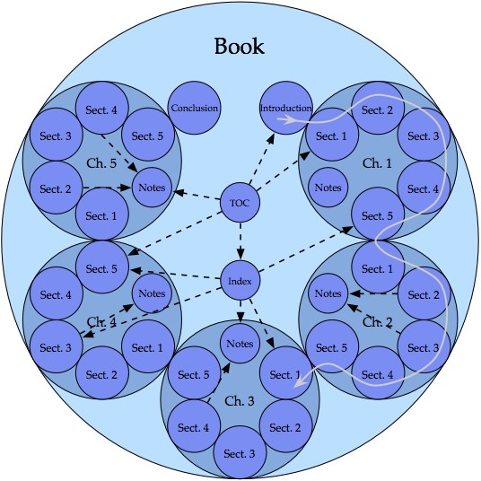
This diagram has been arranged to show not only the hierarchy, but also the intended use pattern of a typical, linear, non-fiction book.
- Continuity in the book is indicated by contact of the circles.
- The gray line, progressing in small and large clockwise arcs from section to section and chapter to chapter, demonstrates the linear progression of the content.
- The dashed black arrows show some possible non-linear paths that may be traveled by the reader to view content that is not part of the main linear flow of the book.
The goal of displaying the use of the book, and not merely the hierarchy, has led to an atypical diagram that conveys more knowledge than the typical counterpart.
I created this diagram in the fall of 2003. It appears in my thesis, and was selected to be supporting material for the book The Practical Guide to Information Design, by Ronnie Lipton.
12
Oct
Generation of Complex Diagrams: How to Make Lasagna Instead of Spaghetti
Update 2011: Many of the ideas in this thesis have evolved and been carried over into my book Designing Data Visualizations.
My master’s thesis is a system for creating good diagrams. It starts with the basics of perception and cognition, and walks the reader through the process of making appropriate choices for their particular design problem.
From the abstract:
This thesis presents a system for the generation of complex diagrams. “Complexity†is defined as a measure of distinct data types that are independently visually encoded. Diagrams representing four or more types of data are defined as complex, while diagrams representing three or fewer are simple. Successful generation of complex diagrams is dependent on appropriate design choices. Five fundamental principles are introduced to guide the choices made by the diagram designer. The two contextual fundamental principles are “different goals require different methods,†addressing the needs of the diagram designer, and “audience brings context with them,†addressing the needs and context of the diagram reader. The three perceptual fundamental principles are the “principle of information availability,†which guides the selection and density of the diagram elements, the “principle of semantic distance,†which guides the spatial placement and grouping of the diagram elements, and the “principle of informative changes,†which guides the visual encoding of the diagram elements. A review of the diagram design process, comprising selection, encoding, and placement of the diagram components, is given. For each phase of the design process the influence of the appropriate fundamental principles is discussed, and the fundamental principles are extended into applied guidelines and suggestions.