16
Nov
Mapping Migration critique
A friend asked me what I thought about the NYT Mapping Migration visualization.
It’s interesting that they note this is a new (experimental) kind of visualization; frankly I think it doesn’t work very well.
To review, you (well, I) do visualization like this (one tweet version; hours long version).
In this case, it feels more like they had a structure they wanted to use (well, two structures, treemap and geographic map, they wanted to mash up and use). So that’s a fundamental design failure because structure drives meaning so strongly, you really ought to pick structure in response to your purpose, not structure first. But this seems structure-driven, not purpose-driven.
If I were to communicate this same information I’d say the purpose is to show the relative proportions of origins of each state’s population. Now a geographic map is a bad way to talk about population in general, because geographic size has nothing to do with population (NJ has about 10x the population and 1,000x the population density of Alaska), and so you get all kinds of accidental distortion. However, geographic maps are really good at showing things like regional trends, so there may be some value there.
So how to show proportion per state and also maintain regional relevance? For proportion a classic tree map (subdivided rectangular area, not Voronoi), or even pie graph, per state could work; they almost got that right. Instead of using the geographical shape of each state, each state could be represented with a size proportional to its population with a cartogram, similar to how the electoral vote results maps work.
The result would be the largest square for California, smaller squares for other states. Each state square would be subdivided into regional areas, each area proportional to population origin and colored as they have them here. If it was me, I’d use consistent placement for the colors, yellow/west always on the left, red/east always on the right, etc.
If you wanted to do something other than a tree map, bar graphs (either stacked or side by side) per state would work perfectly well too, but that’s a little harder to implement and keep the geographical relevance.
17
Jan
How to pick a graph
I just tweeted this:
Step 5: What graph do I use?
4: What data matters?
3: What Q’s need answering?
2: What actions do I need to inform?
1: What do I care about?
7
Jan
Visualization errors to avoid
I wrote a blog post on avoiding visualization errors over at Information Week.
7
Nov
Four Pillars of Visualization
Please enjoy content based on my Four Pillars of Visualization design principles. I hope you find it useful. The best way to reach me to provide errata and feedback is on twitter.
The Four Pillars are:
- Purpose (the why)
- Content (the what)
- Structure (the how)
- Formatting (everything else)
Here are the resources. I’ll update this page as new material comes online. Everything is free.
- When I worked for IBM I presented a five-part webcast based on the Four Pillars. The videos are no longer available, but here are PDFs of the slide decks: 1, 2, 3, 4, 5
- These focused whitepapers go more in-depth on how to make good design choices for pillars 3 and 4.
- A slide deck from spring 2016 covering the process, which works for a lot of styles of communication, not just visualization.
Â
- A recordings of me presenting the Four Pillars
- The first public talk I gave about the Four Pillars.
7
Nov
Unbroken Excel
Because I mention it all the time, here’s Cole Nussbaumer‘s template for good Excel graphs, where she’s fixed all of the bad Excel defaults.
8
Mar
Big news, new job at IBM… and moved on.
Updated update: I’m no longer with IBM, and have taken a job in Settle with AWS.
Hello dear readers,
Just a quick note here to mention my new FT gig; I’m now working as a Visualization Expert at IBM’s Center for Advanced Visualization. Part of my role involves continuing to speak at conferences and events as I have been, and various other writing projects. Additionally, I’ll be working on a book for IBM (details TBD), writing some visualization white papers, blog posts, and other materials related to IBM’s visualization projects, and working with the fantastic teams who are devloping IBM’s public visualization tool Many Eyes and their new (unreleased) visualization engine RAVE.
I’m delighted by this new role. As I’ve been ramping up at IBM I haven’t been publishing as much externally, but will be posting links to my writing and presentations here and on twitter (@noahi) as they become available.
Best, Noah
UPDATE: Yes, I’m staying in Seattle.
26
Oct
Process notes handout
Here are some visualization process notes from my talks and tutorials.
27
Aug
Talks: first half of 2012
Here are the various, videos, recordings, transcripts, notes, and slide decks from some of the talks I gave in the first half of 2012. With one exception, all of these are free to view or download.
January 21, ORDcamp Ignite Talk Data Visualizations Done Wrong: live lecture recording. 5:11 (quick and fun)
January 25, Strata presentation preview Design Thinking for Effective Data Visualization: online lecture. 17:15
January 27, UIE Virtual Seminar preview podcast The Power of Data Visualization: audio recording, transcript. 29:50
February 2, UIE Virtual Seminar Telling the Right Story with Data Visualization: online lecture with slides; paid. 90 minutes. (With free preview. 1:08)
February 23, Visual.ly blog guest post Why Is Data Visualization So Hot?
March 16, UIE Virtual Seminar follow up podcast: audio recording, transcript. 30:38
April 2, Where conference interviewed by Julie Steele: video. 11:55
April 3, Where conference keynote When Not to Use Maps, live lecture recording. 11:32 (this one is fun too)
April 4, Linked In Tech Talk Designing Data Visualizations, live lecture recording, with extra conversation about visualization of social networks. 1:49:12
July 12, dotAstronomy conference keynote How to be a Data Visualization Star, with Julie Steele: live lecture audio recording, with still images, slides, and time-coordinated notes twitter responses. 53:05
July 16, European Bioinformatics Institute guest lecture Designing Effective Data Visualizations, handouts, sketchnotes, slide decks (I love the sketchnotes).
24
Jan
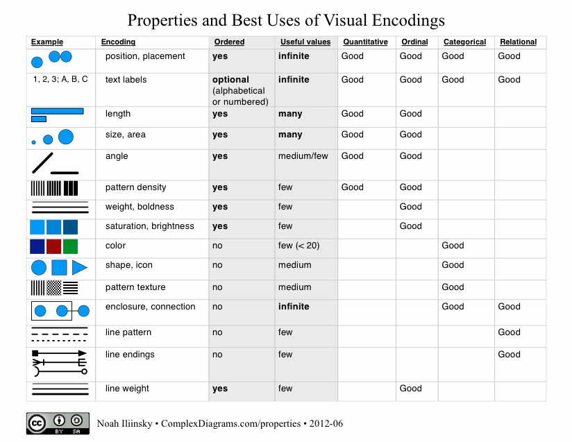
Properties and Best Uses of Visual Encodings
Here’s my table of properties and best uses of visual encodings. Feel free to download the PDF.
Update September 25, 2013: I wrote a whitepaper for IBM that explains the use of the table.
Please note that I’m not the first person to create a table like this, this just happens to be my take on it. I got my first glimpse at this sort of table in Jock Mackinlay‘s PhD thesis from 1986.
A really nice table comparing inclusion of visual properties/attributes in tables has been put together by Richard Brath.
20
Dec
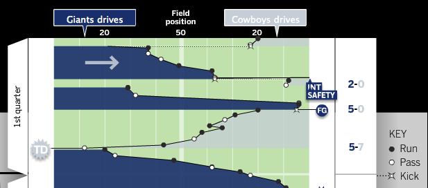
Great visualization: Pro-football game charts
From Chartball.com: Pro-football game charts.

They’ve done an excellent job here, visually representing:
- direction of play
- position of each down
- game time on the vertical axis
- type of play (run, pass, kick)
- scoring events
- other events, such as fumbles and intercepts
Great use of the field metaphor and direction, as well as team colors. I’d like to see what this looked like with encodings for the downs (shape for type of play, and down encoded by saturation?), but overall it’s excellent. And I should note that the detailed information on each play is available when you mouse-over each event.
