15
Jan
Speaking at Puget Sound SIG CHI Jan 22nd
I invite you to come see me present at the Puget Sound SIG CHI meeting next week.
The topic is User-Centered Information Design
This presentation teaches a practical process for designing successful informative visuals. It begins by discussing the importance of understanding your audience’s needs, and perception and cognition factors that enhance the effectiveness of your visual. This knowledge is then used to inform a step-by step design process, which takes you from a blank page to a complete, successful visual. The process specifically addresses choosing what information to include, where to put it on the page, what it should look like, how it should be labeled, what the links and axes look like, etc.
Thursday January 22nd, 6 – 8:30pm
One Union Square Board Room
600 University St
Seattle, WA 98101-1176
The first hour or so is socializing, networking, etc. The lecture will start around 7, with questions after. This event is free.

22
Dec
VizThink discount code
If you’re thinking of going to VizThink and haven’t yet registered, I have a $100-off discount code for you. Let me know if you’d like it.
17
Dec
Presenting at VizThink 2009
I will be presenting two sessions at VizThink 2009, Feb. 22-25, in San Jose. The sessions are a 90-minute workshop on User-Centered Information Design and a 20 minute “snapshot” talk on Visualizing Complexity.
If you see me there, please introduce yourself!
14
Oct
Infocamp 2008 Presentation
This is the slideshow and audio from my Infocamp 2008 presentation on User-Centered Information Design.
The audio synchronization seems to work when played straight through, but not when you manually advance the slides.
1
Oct
Multi-poll tracker
The Takeaway has a clever interactive graph, showing the summary from a different poll or tracking web site on each row, and the states as columns. Column width reflects the number of electoral votes for that state. It’s a good way to get an aggregate view of what’s going on, as each source is a little different.
They’ve done a great job with this; it’s a great presentation of a ton of information abstracted in a constructive manner. The key issues (weight and inclination of each state) are present, with very little else to get in the way.
There are a few changes I’d make. The mouseover key is a little awkward, as it obstructs a lot of the image. I probably would have gotten rid of it altogether, and put the state info in the footer, as they’ve done with the poll name and score. I probably also would have put the score for each row in the row, either at the left, near the icon, or in a rightmost column, rather than forcing you to mouseover each column.
18
Sep
More economic charts
A few more bits of visual goodness related to dollars and sense for this election season.
===
Freakonomics has a nice follow-up to the Washington Post graphic below, showing two slightly different versions that are optimized to see the breakdowns in numbers of people and percent of tax income related to each segment. Great stuff. Go check it out.
(Via Tim O’Reilly’s twitter)
===
Digital Roam has a whole series of hand-drawn micro-graphs showing economic activity and indicators for the Bush and Clinton administrations. Clear, simple, and very compelling.
4
Sep
Tax Policy Graphs
The Washington Post has published this excellent graphic comparing the proposed tax policies of the two mainstream candidates. It does a great job of clearly contrasting the impact per tax-bracket in terms of percent and average change in tax burden.
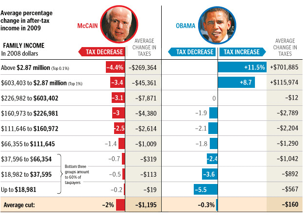
Click through for their brief commentary. (And note that it’s brief because the graph does a good job of saying it all.)
29
Jun
The Electoral Vote Race
Electoral-Vote.com is an excellent and popular site for tracking polls for president on a state by state basis. One of the nice features is a historical graph that shows the changing number of electoral votes for each candidate over the election season.
Currently it looks something like this:
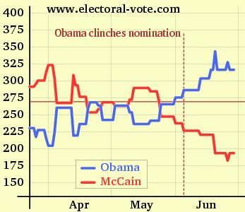
(click to see the original on electoral-vote.com)
Just for fun, I decided to see what it would look like showing the candidate totals as a single shared line. keep reading…
5
May
Harvard Business Review on infovis
The Harvard Business Review has published an article by researchers from IBM’s Many Eyes project, discussing the benefits of good information visualization.
A choice quote:
Our research has found that the compelling presentation of data through visualization’s advanced techniques generates a surprising volume of impassioned conversations… That level of engagement could foster the kind of grassroots innovation CEOs dream of.
Hopefully this will help increase corporate interest in information visualization.
(via Information Design Watch)
Comments temporarily disabled due to spam.
29
Apr
Video of my Ignite talk
This is the talk I gave at Ignite Seattle 5, February 19, 2008. The Ignite format requires presenting 20 slides in 5 minutes, with the slides advancing every 15 seconds whether the presenter is ready or not. The original name for this format was “Ask Later.”