16
Dec
Working on Beautiful Visualization book
I’m very excited to announce that I’m technical editor for, and contributing a chapter to, the book Beautiful Visualization, due out in April from O’Reilly.
It is a collection of case studies and articles discussing how various beautiful information visualizations were achieved and how to create your own.
Stay tuned for updates as events warrant.
12
Mar
Tire selection chart
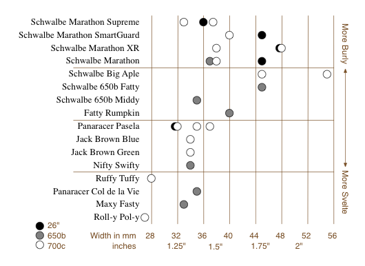
This is a short story of user experience, information visualization, and design choices. I like Rivendell Bicycle Works for a lot of reasons (see below). However, one thing they don’t do particularly well is allow you to compare products on their web site.
When comparing a few randomly sorted parts, such as rear deraillers, looking at all 3 or 4 choices and then choosing one is relatively easy. When the choice is among 16 tire models in three rim diameters, various widths, some with various features (kevlar bead, anti-puncture, etc.), spread across three pages, in no particular* order, doing a comparison and then confidently choosing one is really, really difficult.
To address this sub-optimal user experience issue, I created this chart to make life easier for customers, improve the interface for comparing the tire offerings, and hopefully improve sales.

It allows the (potential) customer to quickly focus on the appropriate tires(s) based on desired rim size, tire width, and toughness/quickness, and then click the chart to go directly to the tire’s page. (Note that some of these links are going to break as the selection of tires for sale changes.) keep reading…
26
Feb
VizThink wrap-up and notes
VizThink ’09 was awesome. I’ve come back exhausted, energized, and inspired, with a load of new ideas.
Thanks to everyone who presented, who attended my sessions, who asked good questions in all situations, who I talked with and listed to and shared meals with. It was a fantastic time. Special thanks goes out to the crew (and families of!) who put on the conference; I appreciate your hard work and perseverance.
As promised, here are the documents that support my sessions. The best online version of my User-Centered Information Design talk is the version from Infocamp ’08, which includes narration. The only slides missing from that presentation are the design process guidance slides, which I’ve made into a handy PDF.
The snapshot talk on visualizing complexity was supported by this document.
As always, I’d love to hear from you about what worked, what didn’t, lingering or new questions, and anything else on your mind.
5
Feb
Bike map legends
Here’s a straightforward case of two different agencies presenting similar information in different ways, one with better design choices and one with more arbitrary, less useful choices. Both King County and the City of Seattle (where I live) publish regional bike maps with markings for bike lanes and trails. Compare how they are encoded. keep reading…
14
Oct
Infocamp 2008 Presentation
This is the slideshow and audio from my Infocamp 2008 presentation on User-Centered Information Design.
The audio synchronization seems to work when played straight through, but not when you manually advance the slides.
29
Jun
The Electoral Vote Race
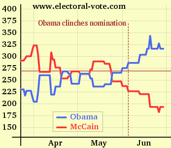
Electoral-Vote.com is an excellent and popular site for tracking polls for president on a state by state basis. One of the nice features is a historical graph that shows the changing number of electoral votes for each candidate over the election season.
Currently it looks something like this:

(click to see the original on electoral-vote.com)
Just for fun, I decided to see what it would look like showing the candidate totals as a single shared line. keep reading…
29
Apr
Video of my Ignite talk
This is the talk I gave at Ignite Seattle 5, February 19, 2008. The Ignite format requires presenting 20 slides in 5 minutes, with the slides advancing every 15 seconds whether the presenter is ready or not. The original name for this format was “Ask Later.”
4
Apr
Zillow diagram of market segment value changes
Zillow has posted a series of excellent diagrams which show relative changes in assorted housing markets, broken down by segment. Their diagrams are very clear and allow fairly quick access to a lot of good information. Please go explore there, and then come back here for my commentary. keep reading…
7
Mar
Humorous pop-culture visuals: Song Charts
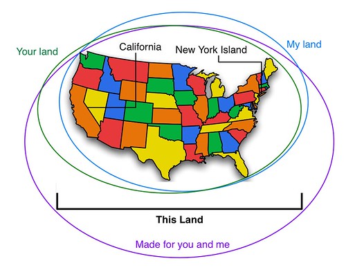
I was just introduced to the Song Chart group group on Flickr. It’s full of visualizations of song lyrics. Many are clever, many are hilarious. This is my contribution.
16
Feb
Presenting at Ignite Seattle
This Tuesday, February 19th, I’ll be one of several presenters at Ignite Seattle. Come if you can; it will be a good time.
