15
Sep
A quick redesign of useless graphs
After seeing a poor infographic re-posted, I briefly ranted on twitter:
Terrible presentation of data. The bars are OK, the rest is worthless. http://bit.ly/o76BOm @litmusapp #fb #li
I don’t mean to be harsh, but #infovis culture needs constructive critique to improve, not just reposting. /cc @visualizingOrg @litmusapp
To put my mouse where my mouth (well, keyboard) is, I present two quick & dirty re-drawings, with commentary, of the first two sections of the poor infographic.

In both of these sections, an aesthetically pleasing, but not-very-functional, donut graph has been used. In both cases, it’s the wrong choice, though for different reasons.
keep reading…

12
Sep
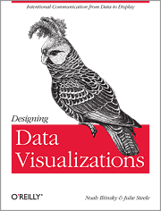
New book: Designing Data Visualizations
I’m thrilled to announce my latest book, Designing Data Visualizations.
The goal of this book is to teach you the process of designing a visualization, presenting the important considerations, and informing the choices that you make. It’s tool-agnostic, and is entirely applicable to visualizations with high and low volumes of data, and to both quantitative and qualitative visualizations.
I was fortunate to have Julie Steele as my co-author on this book. Julie was the lead editor and a contributor to Beautiful Visualization.
The origins of my thinking on this topic lie in the work I did on my master’s thesis. This book benefits from an additional five years of experience and research on my part, as well as Julie’s vital insight, knowledge, and contributions.
For this book, we (the authors) are recommending the electronic version over the print version, as that will allow you easy access to updates and revisions as we add more examples and such. Also, the print edition will sadly be only in grayscale, whereas the electronic version will be full-color.
Update: looks like we’ll be providing a full-color download of the images so that people who buy the print edition don’t miss anything.
We’re very excited about this book. We hope you will be too.
11
Sep
Presenting at Strata
I’ll be speaking at Strata NY next week. My main talk is Designing Data Visualizations, on Friday the 23rd at 11:30am.
I’ll also be presenting at the Visualization Showcase Tuesday evening, and at Ignite Strata Wednesday evening.
On Friday at 1pm I’ll be at the O’Reilly booth, signing copies of Beautiful Visualization. Not sure if Designing Data Visualizations will be available in print by then, but if it is, I’ll be signing those too. (You probably want the electronic version of DDV anyway.)
Hope to see you there!
18
May
UIE Virtual seminar podcast
Here’s the podcast and transcript that goes with my virtual seminar on visualization for UIE. In this podcast I talk a lot about basic visualization concepts, with some good Q&A. It’s good foundational material.
1
May
Beautiful Visualization Chapter 1: On Beauty
This is an excerpt from my chapter in Beautiful Visualization. You can download a pdf of the entire chapter.
Chapter One: On Beauty, by Noah Iliinsky
This chapter is an examination of what we mean by beauty in the context of visualization, why it’s a worthy goal to pursue, and how to get there. We’ll start with a discussion of the elements of beauty, look at some examples and counterexamples, and then focus on the critical steps to realize a beautiful visualization.
[I use the words visualization and visual interchangeably in this chapter, to refer to all types of structured representation of information. This encompasses graphs, charts, diagrams, maps, storyboards, and less formally structured illustrations.]
What is Beauty?
What do we mean when we say a visual is beautiful? Is it an aesthetic judgment, in the traditional sense of the word? It can be, but when we’re discussing visuals in this context, beauty can be considered to have four key elements, of which aesthetic judgment is only one. For a visual to qualify as beautiful, it must be aesthetically pleasing, yes, but it must also be novel, informative, and efficient.
Novel
For a visual to truly be beautiful, it must go beyond merely being a conduit for information and offer some novelty: a fresh look at the data or a format that gives readers a spark of excitement and results in a new level of understanding. Well-understood formats (e.g., scatterplots) may be accessible and effective, but for the most part they no longer have the ability to surprise or delight us. Most often, designs that delight us do so not because they were designed to be novel, but because they were designed to be effective; their novelty is a byproduct of effectively revealing some new insight about the world. keep reading…
9
Mar
Presenting in London
Come out to sameAs in London on March 28th for a night of visualization conversation.
9
Mar
Podcast with Jared Spool
Jared Spool interviewed me for Brain Sparks. It’s a 30 minute podcast; the title is Steps to Beautiful Visualizations.
Update: there’s a mostly-accurate transcript available as well.
23
Feb
Web App Master’s Tour
This year I’ll be presenting at the Web App Master’s Tour, along with many other brilliant folks. Come see us in Philadelphia March 21-22, Seattle May 23-24, or Minneapolis June 27-28.
Save $100 off the current price by using the discount code WAMT11. That plus the early bird savings is worth $300 total off of the the standard price.
I look forward to seeing you there!
9
Dec
How to design visualizations
I posted a quick process reference called How to design good data visualizations, diagrams, and information graphics over at O’Reilly Answers.
22
Jun
Q&A on Beautiful Visualization
I was recently asked some questions about the Beautiful Visualization (O’Reilly 2010) and my role as the technical editor and chapter contributor.
How did you end up working on Beautiful Visualization?
I was given the opportunity to work on the book because of my previous research and master’s thesis on methods of creating quality information visualizations.
Why is this book especially important now?
This is a particularly exciting time to be working with information visualization.
Visualization has become popular over the last few years. There have been some very good visualizations making it into the media and pop culture recently, and they have reached millions of people. Of note, the 2008 elections and current World Cup tournament have inspired dozens of visualizations that have received a lot of attention. Good visualizations are fun, educational, and engaging. People enjoy them, and some publications such as the New York Times and GOOD magazine are becoming known for their (generally high quality) work with information visualizations.
keep reading…