26
Oct
Process notes handout
Here are some visualization process notes from my talks and tutorials.
27
Aug
Talks: first half of 2012
Here are the various, videos, recordings, transcripts, notes, and slide decks from some of the talks I gave in the first half of 2012. With one exception, all of these are free to view or download.
January 21, ORDcamp Ignite Talk Data Visualizations Done Wrong: live lecture recording. 5:11 (quick and fun)
January 25, Strata presentation preview Design Thinking for Effective Data Visualization: online lecture. 17:15
January 27, UIE Virtual Seminar preview podcast The Power of Data Visualization: audio recording, transcript. 29:50
February 2, UIE Virtual Seminar Telling the Right Story with Data Visualization: online lecture with slides; paid. 90 minutes. (With free preview. 1:08)
February 23, Visual.ly blog guest post Why Is Data Visualization So Hot?
March 16, UIE Virtual Seminar follow up podcast: audio recording, transcript. 30:38
April 2, Where conference interviewed by Julie Steele: video. 11:55
April 3, Where conference keynote When Not to Use Maps, live lecture recording. 11:32 (this one is fun too)
April 4, Linked In Tech Talk Designing Data Visualizations, live lecture recording, with extra conversation about visualization of social networks. 1:49:12
July 12, dotAstronomy conference keynote How to be a Data Visualization Star, with Julie Steele: live lecture audio recording, with still images, slides, and time-coordinated notes twitter responses. 53:05
July 16, European Bioinformatics Institute guest lecture Designing Effective Data Visualizations, handouts, sketchnotes, slide decks (I love the sketchnotes).
24
Jan
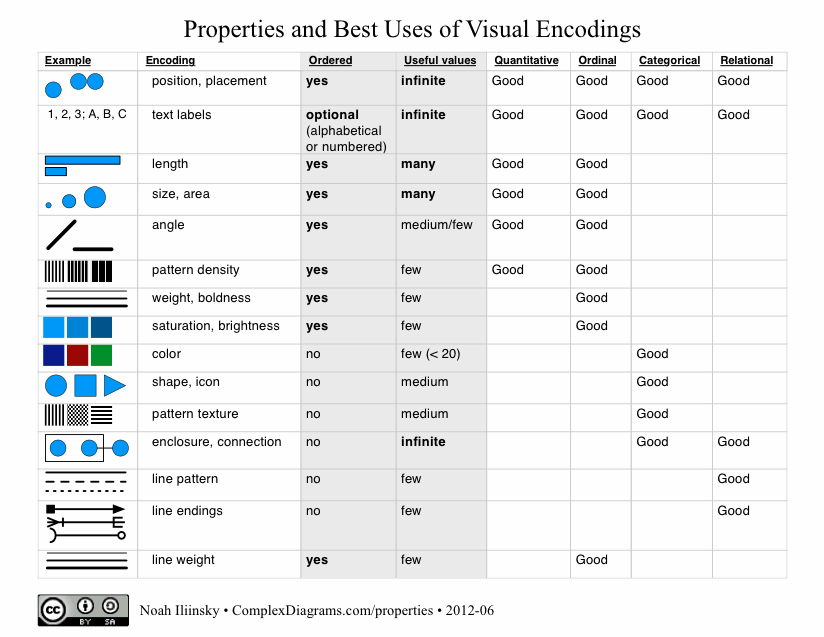
Properties and Best Uses of Visual Encodings
Here’s my table of properties and best uses of visual encodings. Feel free to download the PDF.
Update September 25, 2013: I wrote a whitepaper for IBM that explains the use of the table.
Please note that I’m not the first person to create a table like this, this just happens to be my take on it. I got my first glimpse at this sort of table in Jock Mackinlay‘s PhD thesis from 1986.
A really nice table comparing inclusion of visual properties/attributes in tables has been put together by Richard Brath.
28
Dec
Speaking at Strata 2012
I’ll be giving a workshop on effective data visualization. Get a 25% discount when registering by using the code SPEAKER25
Hope to see you there!
20
Dec
Great visualization: Pro-football game charts
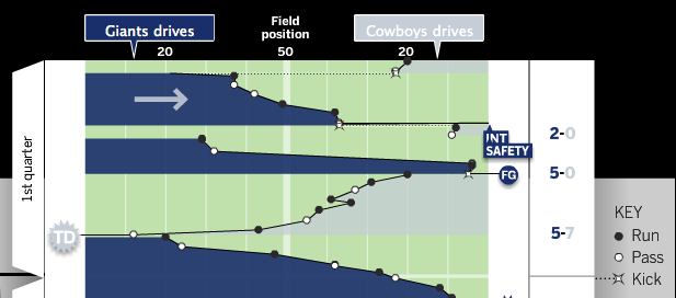
From Chartball.com: Pro-football game charts.

They’ve done an excellent job here, visually representing:
- direction of play
- position of each down
- game time on the vertical axis
- type of play (run, pass, kick)
- scoring events
- other events, such as fumbles and intercepts
Great use of the field metaphor and direction, as well as team colors. I’d like to see what this looked like with encodings for the downs (shape for type of play, and down encoded by saturation?), but overall it’s excellent. And I should note that the detailed information on each play is available when you mouse-over each event.
15
Dec
Appearances at Strata NYC 2011
Two appearances from the Strata conference in New York this past September.
I gave an Ignite talk called Visualization Done Wrong. This video has too much of me and not enough of my slides.
Alex Howard interviewed me about my new book Designing Data Visualizations and related topics.
I’ll be giving a three hour data visualization workshop at Strata in Santa Clara in February 2012.
5
Oct
Thank you Steve Jobs
Edit: the audio of the speech mentioned below is available as an mp3.
From: Noah Iliinsky
Date: August 26, 2011 11:04:21 AM PDT
To: sjobs@apple.com
Subject: History, inspiration, thanks.
Dear Steve,
Twenty years ago this week, we were in the same room. You were speaking to the incoming class at Reed College, and I was one of those freshmen. I remember you talking about your time at Reed, how you were always hungry, ate Roman Meal because it was filling, and would go to the Hare Krishna temple because they’d feed you (and then you’d all go steal flowers out of yards to sell). You had a friend, maybe a dean, who’d slip you $20 or $50 once in a while when you went for walks.
I was excited to see you that day, because I’d fallen in love with the Macintosh four years earlier, in 1987, when I was 13. It was so clear to me what a superior solution it was, relative to everything else that existed. It was fully as magical then as the iPad is now. I don’t know whether it inspired my passion for excellent design, or resonated with an innate sense that was already there, but that passion has never left me.
(Incidentally, while at Reed, I loved using the NeXT machines, and took a computing class from Richard Crandall. I remember your welcome greeting in the Mail program.)
These days I’m still focused on creating excellent experiences; I consult, lecture, and write (http://www.oreillynet.com/pub/au/4419) about information visualization, specifically in the domain of helping people learn how to do it well, so they can create successful, efficient, beautiful solutions.
Thank you, Steve, for all that you’ve done for us over the last 30+ years. Not only have you brought amazing designs to the world, and proven to the world that design deeply matters, but your dedication and vision has inspired me (and thousands of other designers) to do excellent work, to strive to continuously create better solutions. I cannot imagine what my life would have looked like without your contributions. Thank you.
Very best wishes, Noah
15
Sep
A quick redesign of useless graphs
After seeing a poor infographic re-posted, I briefly ranted on twitter:
Terrible presentation of data. The bars are OK, the rest is worthless. http://bit.ly/o76BOm @litmusapp #fb #li
I don’t mean to be harsh, but #infovis culture needs constructive critique to improve, not just reposting. /cc @visualizingOrg @litmusapp
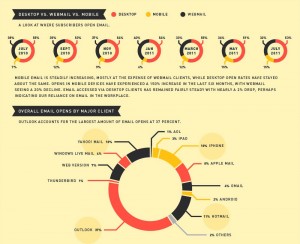
To put my mouse where my mouth (well, keyboard) is, I present two quick & dirty re-drawings, with commentary, of the first two sections of the poor infographic.
In both of these sections, an aesthetically pleasing, but not-very-functional, donut graph has been used. In both cases, it’s the wrong choice, though for different reasons.
keep reading…
12
Sep
New book: Designing Data Visualizations
I’m thrilled to announce my latest book, Designing Data Visualizations.
The goal of this book is to teach you the process of designing a visualization, presenting the important considerations, and informing the choices that you make. It’s tool-agnostic, and is entirely applicable to visualizations with high and low volumes of data, and to both quantitative and qualitative visualizations.
I was fortunate to have Julie Steele as my co-author on this book. Julie was the lead editor and a contributor to Beautiful Visualization.
The origins of my thinking on this topic lie in the work I did on my master’s thesis. This book benefits from an additional five years of experience and research on my part, as well as Julie’s vital insight, knowledge, and contributions.
For this book, we (the authors) are recommending the electronic version over the print version, as that will allow you easy access to updates and revisions as we add more examples and such. Also, the print edition will sadly be only in grayscale, whereas the electronic version will be full-color.
Update: looks like we’ll be providing a full-color download of the images so that people who buy the print edition don’t miss anything.
We’re very excited about this book. We hope you will be too.
11
Sep
Presenting at Strata
I’ll be speaking at Strata NY next week. My main talk is Designing Data Visualizations, on Friday the 23rd at 11:30am.
I’ll also be presenting at the Visualization Showcase Tuesday evening, and at Ignite Strata Wednesday evening.
On Friday at 1pm I’ll be at the O’Reilly booth, signing copies of Beautiful Visualization. Not sure if Designing Data Visualizations will be available in print by then, but if it is, I’ll be signing those too. (You probably want the electronic version of DDV anyway.)
Hope to see you there!


