9
Jun
Deal on Beautiful Visualization
Beautiful Visualization, published by O’Reilly Media, is their deal of the day today. Get the ebook version for just $9.99 with the discount code DDVSZ.
The print edition should be available by the end of June.

23
May
Critique: periodic table of controllers
We Love Datavis posted this Periodic Table of Controllers by Mike Vasilev.
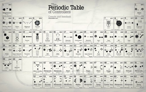
It’s interesting and clever, and suffers from the same problem that plagues all periodic tables of not-elements: the contents of the table aren’t periodic, rendering the periodic format irrelevant. In this case we’re looking at a chronological list, that happens to be laid out in the shape of the periodic table.
This is unfortunate for two reasons. The first is it propagates pointless use of the periodic table format. The second is this data could have been represented in a much more interesting and useful way, that more closely matched the native structure of the data and that revealed that structure in an accessible way. It would have made a fascinating study of the evolution of the controller form factor. Imagine a great family tree, showing the generational changes of the main branches of Nintendo, Sony, etc., with origins and cross influences indicated, innovations highlighted, and the dead-ends clearly represented. Instead we get a format that avoids revealing the interesting relationships that exist.
I’d love to see it redrawn by someone who knows the game controller lineage. Any volunteers?
(To be clear, this is not a critique of the designer, who’s done a great job with this image. It is a critique of the misuse of the format; this particular image is just the latest in a line of hundreds of images using the periodic format for non-periodic data.)
24
Jan
Organic growth of a social network
There are many visualizations of social networks, most of which focus on who knows who. They provide a basic view with limited utility. Some visualizations refine this basic view by grouping areas of people who share common contexts (e.g. college, work, etc.). That approach can add some insight through the slightly increased complexity, but it is still a very limited view of the network.
This movie reveals more knowledge by showing not only which individuals know each other, but also when and how the social network formed, by calling out the contexts and individuals responsible for an introduction between two new friends. Visually representing more complexity allows the viewer a deeper understanding of the social dynamics and causalities involved.
Comments closed due to spam.
16
Dec
Working on Beautiful Visualization book
I’m very excited to announce that I’m technical editor for, and contributing a chapter to, the book Beautiful Visualization, due out in April from O’Reilly.
It is a collection of case studies and articles discussing how various beautiful information visualizations were achieved and how to create your own.
Stay tuned for updates as events warrant.
8
Apr
UI FAIL
Unfortunately, you can’t click anywhere below to get to the categories explained there, and instead must find the category in the pulldown menu above. Terrible.
12
Mar
Tire selection chart
This is a short story of user experience, information visualization, and design choices. I like Rivendell Bicycle Works for a lot of reasons (see below). However, one thing they don’t do particularly well is allow you to compare products on their web site.
When comparing a few randomly sorted parts, such as rear deraillers, looking at all 3 or 4 choices and then choosing one is relatively easy. When the choice is among 16 tire models in three rim diameters, various widths, some with various features (kevlar bead, anti-puncture, etc.), spread across three pages, in no particular* order, doing a comparison and then confidently choosing one is really, really difficult.
To address this sub-optimal user experience issue, I created this chart to make life easier for customers, improve the interface for comparing the tire offerings, and hopefully improve sales.

It allows the (potential) customer to quickly focus on the appropriate tires(s) based on desired rim size, tire width, and toughness/quickness, and then click the chart to go directly to the tire’s page. (Note that some of these links are going to break as the selection of tires for sale changes.) keep reading…
26
Feb
VizThink wrap-up and notes
VizThink ’09 was awesome. I’ve come back exhausted, energized, and inspired, with a load of new ideas.
Thanks to everyone who presented, who attended my sessions, who asked good questions in all situations, who I talked with and listed to and shared meals with. It was a fantastic time. Special thanks goes out to the crew (and families of!) who put on the conference; I appreciate your hard work and perseverance.
As promised, here are the documents that support my sessions. The best online version of my User-Centered Information Design talk is the version from Infocamp ’08, which includes narration. The only slides missing from that presentation are the design process guidance slides, which I’ve made into a handy PDF.
The snapshot talk on visualizing complexity was supported by this document.
As always, I’d love to hear from you about what worked, what didn’t, lingering or new questions, and anything else on your mind.
12
Feb
Bourbon-molasses Supernatural Brownie recipe
[I’m justifying posting a recipe here with the thinking that good food is a good user experience.]
These are my favorite brownies. The recipe is shamelessly stolen (and modified) from the The New York Times and The Splendid Table. See those sites for advice on using baking parchment, fancy unpanning, adding nuts (blasphemy!) or frosting, etc. My additions and notes start with an *.
keep reading…
10
Feb
Follow me on Twitter
For those of you on Twitter, you can find me at @noahi. Please say hi! I tweet about a wider variety of topics than I post about here.
5
Feb
Bike map legends
Here’s a straightforward case of two different agencies presenting similar information in different ways, one with better design choices and one with more arbitrary, less useful choices. Both King County and the City of Seattle (where I live) publish regional bike maps with markings for bike lanes and trails. Compare how they are encoded. keep reading…