20
May
How to buy a practical bike
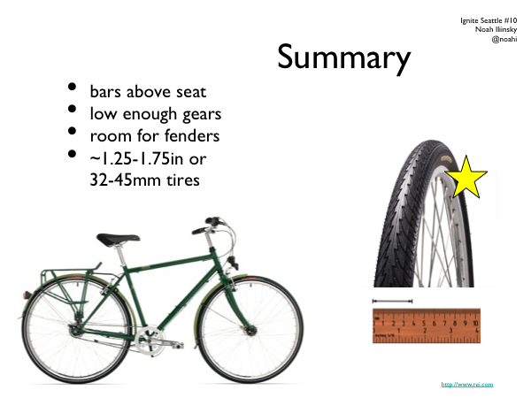
Last summer I gave a talk at Ignite Seattle on how to buy a practical bike. This is the slide deck for that talk. There’s no audio, but you can gather most of it from the images. The summary is below the presentation.
In general, when shopping for a bike, the best thing you can do is ride several and find one that sings to you. Details of manufacturer and parts are less relevant if you like how the bike feels when you ride it.
- At a give price point, most new bikes are going to have a similar mix and quality level of parts.
- Look for a bike where you can get the handlebar at or above the height of the seat when the seat is adjusted to your leg length.
- Low gears are critical if you live near hills or plan on carrying or pulling loads.
- You probably want at least 32mm / 1.25″ wide tires. You don’t need a suspension, or knobby offroad tires, or any tread at all, in the city.
- Your frame should have room for fenders (you can wait until September for those, but shops may install them free if you buy with your new bike).
18
May
UIE Virtual seminar podcast
Here’s the podcast and transcript that goes with my virtual seminar on visualization for UIE. In this podcast I talk a lot about basic visualization concepts, with some good Q&A. It’s good foundational material.
16
May
Video of my sameAs talk in London
This is the video of the talk I gave at sameAs in London on March 28th. It’s about 15 minutes, and is a lighthearted look at good and bad visualization techniques and designs. The audience was about 130 geeks with pints; my slides were being controlled for me. Many thanks to @Kaythaney for inviting me to speak. Enjoy!
SameAs Meetup on Visualisation – Noah Iliinsky from Steven Allen on Vimeo.
SameAs meetup, An evening of visualisation.
Monday 28th March at The Driver, 2-4 Wharfdale Road, Kings Cross, N1 9RY London.
In this talk Noah Iliinsky
Co-author of Beautiful Visualisation.
http://oreilly.com/catalog/0636920000617
http://twitter.com/#!/noahi
Hosts
@Kaythaney & @mza
1
May
Beautiful Visualization Chapter 1: On Beauty
This is an excerpt from my chapter in Beautiful Visualization. You can download a pdf of the entire chapter.
Chapter One: On Beauty, by Noah Iliinsky
This chapter is an examination of what we mean by beauty in the context of visualization, why it’s a worthy goal to pursue, and how to get there. We’ll start with a discussion of the elements of beauty, look at some examples and counterexamples, and then focus on the critical steps to realize a beautiful visualization.
[I use the words visualization and visual interchangeably in this chapter, to refer to all types of structured representation of information. This encompasses graphs, charts, diagrams, maps, storyboards, and less formally structured illustrations.]
What is Beauty?
What do we mean when we say a visual is beautiful? Is it an aesthetic judgment, in the traditional sense of the word? It can be, but when we’re discussing visuals in this context, beauty can be considered to have four key elements, of which aesthetic judgment is only one. For a visual to qualify as beautiful, it must be aesthetically pleasing, yes, but it must also be novel, informative, and efficient.
Novel
For a visual to truly be beautiful, it must go beyond merely being a conduit for information and offer some novelty: a fresh look at the data or a format that gives readers a spark of excitement and results in a new level of understanding. Well-understood formats (e.g., scatterplots) may be accessible and effective, but for the most part they no longer have the ability to surprise or delight us. Most often, designs that delight us do so not because they were designed to be novel, but because they were designed to be effective; their novelty is a byproduct of effectively revealing some new insight about the world. keep reading…
9
Mar
Podcast with Jared Spool
Jared Spool interviewed me for Brain Sparks. It’s a 30 minute podcast; the title is Steps to Beautiful Visualizations.
Update: there’s a mostly-accurate transcript available as well.
9
Dec
How to design visualizations
I posted a quick process reference called How to design good data visualizations, diagrams, and information graphics over at O’Reilly Answers.
22
Jun
Q&A on Beautiful Visualization
I was recently asked some questions about the Beautiful Visualization (O’Reilly 2010) and my role as the technical editor and chapter contributor.
How did you end up working on Beautiful Visualization?
I was given the opportunity to work on the book because of my previous research and master’s thesis on methods of creating quality information visualizations.
Why is this book especially important now?
This is a particularly exciting time to be working with information visualization.
Visualization has become popular over the last few years. There have been some very good visualizations making it into the media and pop culture recently, and they have reached millions of people. Of note, the 2008 elections and current World Cup tournament have inspired dozens of visualizations that have received a lot of attention. Good visualizations are fun, educational, and engaging. People enjoy them, and some publications such as the New York Times and GOOD magazine are becoming known for their (generally high quality) work with information visualizations.
keep reading…
24
Jan
Organic growth of a social network
There are many visualizations of social networks, most of which focus on who knows who. They provide a basic view with limited utility. Some visualizations refine this basic view by grouping areas of people who share common contexts (e.g. college, work, etc.). That approach can add some insight through the slightly increased complexity, but it is still a very limited view of the network.
This movie reveals more knowledge by showing not only which individuals know each other, but also when and how the social network formed, by calling out the contexts and individuals responsible for an introduction between two new friends. Visually representing more complexity allows the viewer a deeper understanding of the social dynamics and causalities involved.
Comments closed due to spam.
16
Dec
Working on Beautiful Visualization book
I’m very excited to announce that I’m technical editor for, and contributing a chapter to, the book Beautiful Visualization, due out in April from O’Reilly.
It is a collection of case studies and articles discussing how various beautiful information visualizations were achieved and how to create your own.
Stay tuned for updates as events warrant.
12
Mar
Tire selection chart
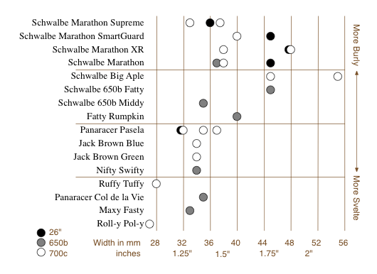
This is a short story of user experience, information visualization, and design choices. I like Rivendell Bicycle Works for a lot of reasons (see below). However, one thing they don’t do particularly well is allow you to compare products on their web site.
When comparing a few randomly sorted parts, such as rear deraillers, looking at all 3 or 4 choices and then choosing one is relatively easy. When the choice is among 16 tire models in three rim diameters, various widths, some with various features (kevlar bead, anti-puncture, etc.), spread across three pages, in no particular* order, doing a comparison and then confidently choosing one is really, really difficult.
To address this sub-optimal user experience issue, I created this chart to make life easier for customers, improve the interface for comparing the tire offerings, and hopefully improve sales.

It allows the (potential) customer to quickly focus on the appropriate tires(s) based on desired rim size, tire width, and toughness/quickness, and then click the chart to go directly to the tire’s page. (Note that some of these links are going to break as the selection of tires for sale changes.) keep reading…
